Law Firm Marketing Blog
Raising the Bar
Web Design, Internet Marketing, Content, and Branding for Lawyers


- Web Hosting & Support
- Web Design
- Ultimate Guides & Best Practices
- Podcast Episodes & Tips
- Newsletters
- Legal Industry News and Tips
- Launches
- Internet Marketing
- Content
- Branding and Design
Join our newsletter, where you will learn educational info on latest insights, tips and best practices.
Subscribe to Newsletter


Podcasts

Launches

Tutorials


Guides
Webinars

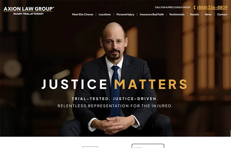
10 Website Design Mistakes Law Firms Need to Avoid

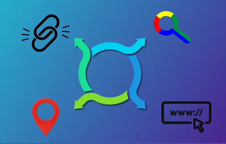
How to Set a Realistic Budget for a Law Firm SEO Campaign

How to Clear WP Engine Cache
Featured
Team Member
Our award-winning law firm marketing team is here for you. Meet the faces behind the impressive work we do at PaperStreet.

Featured
Team Member
Our award-winning law firm marketing team is here for you. Meet the faces behind the impressive work we do at PaperStreet.
Recent Awards
Congratulations to Gang & Associates!
Communicator Award


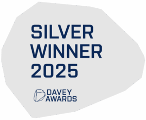
Congrats to Cho Law LLC!
Davey Award

Happy Clients. Positive Results
I would like to express my appreciation and admiration for the outstanding efforts each and every member of your team brought into our project. The sophistication, elegance and overall “top of the line” quality of our new website makes me proud to have recommended you as our partner in this project.
I would like to express my appreciation and admiration for the outstanding efforts each and every member of your team brought into our project. The sophistication, elegance and overall “top of the line” quality of our new website makes me proud to have recommended you as our partner in this project.
I would like to express my appreciation and admiration for the outstanding efforts each and every member of your team brought into our project. The sophistication, elegance and overall “top of the line” quality of our new website makes me proud to have recommended you as our partner in this project.
Learn from the Best Legal Designers, Writers & Marketers in the Industry
We share our knowledge to help aid in your marketing efforts. Learn from the best and subscribe for updates.