Three Keys to Maintaining Accessibility in Your Blog

Accessibility and compliance has been gaining attention in web design circles for years now. While that’s a good thing, ascending to a more inclusive web requires new knowledge and techniques for website maintenance. And it isn’t just web designers and developers who need to keep these principles in mind.
Think “accessibility.” What do you envision? Often it’s a ramp in front of a restaurant for wheelchair access, or braille on an elevator button. Good web accessibility follows along the same lines – think affordances and considerations made to aid those with disabilities – but an accessible website is really just one that offers effective usability.
A thoughtfully designed, usable site is one with readable text and well-selected colors. It can be interacted with by mouse, screen reader, or keyboard – that is, different devices or senses. Its presentation and HTML markup is consistent and just as well understood by a human as by a machine. Sometimes, these principles go by the acronym POUR, short for Perceivable, Operable, Understandable, and Robust.
PaperStreet creates websites with these accessibility principles in place, but not all good accessibility is set in stone in code. In the months and years your firm will be enjoying your website, some responsibility of maintaining good accessibility belongs to you, the content owner and writer. Commonly-updated website sections like your blog can introduce accessibility problems if the goals of compliance aren’t understood.
Fortunately, producing accessibility-friendly blog content is not hard to achieve. Here are three keys to doing just that.
Images and Alt Tags
Reference: https://webaim.org/techniques/alttext/
When adding an image to post content, the attached image should have alternative text, or an “alt tag,” written for it. This allows visitors browsing the website with screen reading technologies to perceive what the image presents. It simply makes the visual content accessible to more users.
Because images are so prevalent on the web, alt tags can be considered a cornerstone of accessibility. But there is an artform to writing them. The referenced link provides many examples of writing alt tags effectively. It is not as simple as bluntly stating “what” is in the image, e.g. “A cup,” although that is better than no alt text at all.
The goal is to succinctly describe the content and function of the image. Do not include text like “image of” or “graphic of” in the alt text.
In many cases you can ask the question “If I could not use this image, what would I put in its place?” to determine appropriate alternative text. (Source: webaim.org)
Adding an alt tag through WordPress® is done when attaching the image through the Media Library. Look for the “Alt Text” field, and enter your text there.

Use of Headings and Headings Order
Reference: https://www.w3.org/WAI/tutorials/page-structure/headings/
It is a good web content practice to use headings in your writing. Just be aware that headings should occur in a logical order.
Think of headings as breaking up the outline of the overall content. They are NOT about styling; they are NOT about sizing text.
Headings come in different “levels,” from a “Heading 1” all the way to “Heading 5” and beyond, but headings past level 3 are rarely used, nor will they be styled in any special way on your website. (In HTML lingo, these headings are known as <h1> through <h5> tags.)
Guidelines:
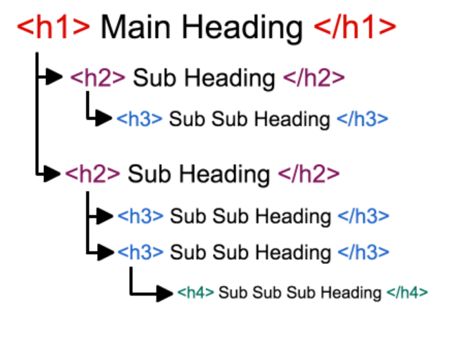
- Do not use Heading level 1 (<h1>) since the website already has an H1 coded into the page, and it should strictly only occur once
- Heading level 2 <h2> should be used as the go-to heading to break page content
- H3s only to subdivide H2s – In other words, when drilling down deeper into an <h2> topic
- H4s only to subdivide H3s
- ..And so on
This means: H2s are very common; H3s are less common; H4s are rare.
Here’s a visual of this hierarchy courtesy nomensa.com:

Avoid Text Formatting, Especially Underlines
Reference: https://webaim.org/techniques/hypertext/link_text
Text formatting in general should be kept very light, if it is done at all. For ideal consistency on the website’s styling, avoid style changes like color swaps. To change how a text appears, change it to a heading or bulleted list; do not attempt to re-style text yourself.
Bold and italics are fine. Underlines are not.
In common web usage, an underline indicates a link. If your website is styled to show links as underlined items, then it will do so. But do not add underlines to content that does not include a link! It is confusing and a negative in terms of accessibility and general usability.
Your Visitors Will Thank You
Three simple keys: If using images, include alt tags; if using headings, treat them like a hierarchy; and if formatting your text, don’t do so with colors or underlines.
Follow these steps, and you’ll be well on your way to ongoing accessibility compliance on your site. Your users will thank you!
What you should do next . . .
Join our newsletter, where you will learn educational info on latest insights, tips and best practices.
Share:
About Us
Did you know more than 200 clients have worked with PaperStreet for more than 10 years?
Get a Free Website
Analysis and Consultation
Marketing Services


