
Lawyer Website Design: 7 Features Every High-Converting Law Firm Website Needs

At PaperStreet, we design award-winning websites for law firms. In 2026, we are celebrating our 25th anniversary. Over the last quarter-century, we have watched lawyer web design grow and transform. When PaperStreet launched in 2001, many law firms were still debating whether they needed a website at all. Today, a law firm website is no longer optional. It is a necessity.
Over time, expectations of what a lawyer’s website should do have evolved. In the early days, most sites were static with basic contact information, biographies, and maybe a list of practice areas. The goal was to have a website that looked good. However, a modern website must do far more than “look good.” Simply put, it must build trust and convert leads into clients.
To be high-converting, a website has to be usable. Potential clients and search engines need to be able to find what they are looking for. Visitors are often stressed, skeptical, or comparison shopping. Poor design can undermine credibility, even if the attorney is highly qualified. Also, effective lawyer website design must balance professionalism with usability and marketing strategy. Oh, and the website is still expected to look good while all of this is happening. For over 25 years, we have noticed that certain core features consistently appear on high-performing law firm websites.
1. Clear Messaging Above the Fold
When a potential client clicks on your link and the designated landing page opens, the visitor should immediately understand the following:
- What the firm does
- Who it helps
- Where it practices
All of this information should be visible without scrolling or moving on the page. Borrowing a term from the print newspaper business, this information should be “above the fold.” If the visitor has to scroll down in order to see this information, they are more likely to move on to the next attorney than to search for it.
Pro tip: When the client is ready to act, do not make them look for your contact information. In your above-the-fold information, include a visible call to action that has a phone number and a consultation button. Also, avoid broad headers with vague slogans that consume the above-the-fold area without offering much substantive information.
2. Mobile-Friendly Responsive Design
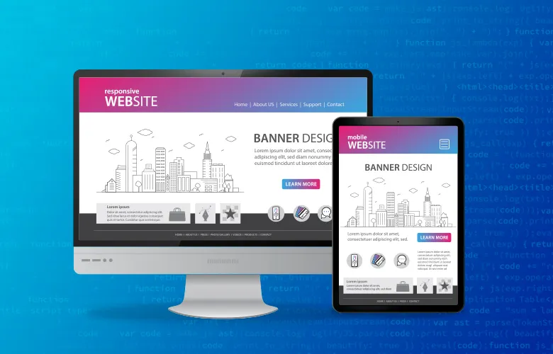
One thing that makes attorneys unique is that they typically work behind a desk with a computer. They use that computer to do most of their internet searches and to check out how the firm’s website is performing. However, most legal website traffic does not come from calm people sitting behind a desk. It comes from mobile devices. The person doing the searching is probably stressed, rushed, and/or upset. According to Forbes, up to 60% of all Google searches occur on mobile devices. Having a mobile-friendly design is essential for a website that converts. Responsive layouts improve usability across:
- Phones
- Tablets
- Desktops
Mobile optimization also impacts Google rankings. Take the time to test your site regularly across a wide range of devices to ensure it continues to deliver the performance you want. Make sure you turn off Wi-Fi and test performance over the cellular network.
Pro tip: When running these tests, use the site as a visitor would. Click on phone numbers. Check to make sure that you can read the text. Move from page to page to make sure everything loads smoothly. Do not forget to test your contact links.
3. Fast Load Speed and Technical Performance
The most overlooked must-have feature is the website’s technical performance. When technical performance bogs down, page load speed slows. Google has reported that 53% of mobile visitors abandon a site that takes longer than 3 seconds to load. Common causes of slow law firm websites include:
- Oversized images
- Bloated plugins
- Poor hosting
- Excessive animations
Website speed impacts both user experience and SEO. Slow websites frustrate users, increase bounce rates, and can hurt search rankings. Even a well-designed website can lose potential clients if visitors abandon the page before it fully loads.
Pro Tip: Think simple. Streamlined design often performs better than overly complicated visuals. Clean layouts, optimized images, and efficient code typically create a faster, more effective experience for prospective clients.
4. Strong Attorney Bios and Trust Signals
Legal hiring decisions are heavily trust-based. When a visitor to your website is deciding if you are “the one,” oftentimes, the only things they have to help make this decision are your bio and picture. Typically, these decisions are made in under five seconds. That is a very short window to make an impression. Effective attorney bio pages should include:
- Experience
- Education
- Awards
- Case results where appropriate
- Speaking engagements
- Publications
Remember, your website bio should not be designed to impress other attorneys. It should be designed to connect with non-lawyers seeking an attorney. Leave out the technical jargon and accolades that only matter to other attorneys. Double down on information that shows who you are, such as hobbies and community involvement.
Pro Tip: Trust building goes beyond website bios. Make sure to use testimonials and reviews to showcase what your firm has accomplished for clients. Also, when possible, leverage third-party trust signals such as media appearances or links to articles that you have authored on other organizations’ websites.
5. Conversion-Focused Calls to Action
When visitors to your website are ready to act, you need to make it as easy as possible to contact you. The sheer emotional factors driving the need to hire an attorney can leave even the most patient of people undone. It doesn’t take much to push a prospective client away at this point. If your website doesn’t make it easy and clear what they are supposed to do next, you may be losing business.
Examples of effective CTAs:
- Schedule a consultation
- Call now
- Speak with an attorney
- Request a case evaluation
The best law firm websites place calls to action strategically throughout the page rather than hiding them at the bottom. Effective CTAs are visible above the fold, accessible on mobile devices, and naturally integrated into the content without disrupting the user experience.
Pro Tip: Audit your contact forms by attempting to complete them on your cell phone. If you cannot complete and submit the form without becoming annoyed, assume your prospective clients will not be able to either.
6. SEO-Friendly Structure and Content
In the early days of legal digital marketing, law firm websites were static. They were build-it-and-forget-it solutions. Today, good lawyer website design supports long-term search engine optimization (SEO) growth. Your website should be an ever-expanding ecosystem of content and information that evolves in sync with your practice and the legal environment around you. Both clients and search engines look for well-organized, up-to-date information that answers their questions.
Important SEO design elements:
- Proper heading structure
- Optimized practice area pages
- Internal linking
- Local SEO signals
- Schema markup
Content, design, and SEO work together to make your firm visible to both potential clients and search engines. The elements that make your content more appealing to humans are, in general, the same elements that search engines are looking for in response to queries.
Pro Tip: Avoid treating SEO as a separate marketing activity disconnected from website design. The highest-performing law firm websites are built from the ground up with content structure, usability, and search visibility working together.
7. Easy Navigation and User Experience
Have you ever been shopping online and gotten frustrated because the company that makes what you want has a website that is not user-friendly? You know what you need. You think the company has what you want. But when you try to make a purchase, you end up running in circles. Whether you stick around long enough depends on how much you want or need the thing you are trying to purchase and whether you can get it elsewhere more easily. Remember, visitors to your website are no different than you when it comes to user experience.
Effective navigation menus should prioritize:
- Practice areas
- Attorney profiles
- Locations
- Contact information
A good user experience reduces friction and increases conversion. Avoid cluttered menus and excessive dropdowns. Look at your website through the eyes of the consumer. What is it that they are looking for? What is necessary to help the visitor make the decision to contact you? What elements of your site are interfering with making that happen?
Pro Tip: If a visitor cannot figure out where to go within a few seconds, they will often leave and contact another law firm. The best navigation systems feel almost invisible because they make finding information effortless.
Creating a High-Converting Law Firm Website
The best law firm websites are built around user experience and client conversion. They are designed to help potential clients quickly find information, build trust in the attorney, and take the next step toward making contact. At PaperStreet, we have spent more than 25 years helping law firms build websites that support both immediate lead generation and long-term marketing success. If your firm is ready to improve its online presence, contact PaperStreet to create a website tailored to your practice, your clients, and your long-term business goals.
What you should do next . . .

We create law firm website designs. Well . . . actually we create stunning, professional websites that get results for our clients. Since 2001, PaperStreet has been helping law firms grow their legal practices.
Join our newsletter, where you will learn educational info on latest insights, tips and best practices.
Share:
About Us
Did you know more than 200 clients have worked with PaperStreet for more than 10 years?
Get a Free Website
Analysis and Consultation
Marketing Services