Lawyer Logo Design: What Your Branding Says About Your Firm (and Clients)
Very few marketing tools are as powerful as a good logo. Logos are not new. The concept goes back thousands of years. Ancient Greek and Roman potters marked their ceramics with unique symbols and signatures. Before literacy grew, medieval shopkeepers and craftsmen hung recognizable symbols above their doors. During the Industrial Revolution, trademarks took on a new meaning. As goods were mass-produced and shipped to broader geographic areas, trademarks became even more important to distinguish goods from those of competitors.
Over time, logos evolved from identification marks to the foundation for branding and marketing campaigns. Logos originally existed to establish authenticity and trust in environments where consumers had limited information. Modern law firm branding serves the same purpose. At PaperStreet, we know that well-designed logos can make law firms instantly recognizable in crowded markets and serve as the foundation of a digital marketing plan.
Why Do Law Firm Logos Matter?
Arguably, law firm logos matter even more today than they did 50 years ago. As the legal market has become increasingly crowded and consumer attention spans have grown exponentially shorter, a memorable, recognizable logo gives you an edge over the competition. On the surface, using your logo as part of consistent branding builds familiarity across websites, social media, advertising, and print materials. A strong logo will allow clients and potential clients to immediately recognize your firm and pick your logo from a list of firms.
Below the surface, logos have the potential to do even more. Clients often make subconscious judgments based on visual presentation. When firms move beyond the standard scales of justice, pillars, and gavels and design a unique logo, it shows creativity and attention to detail. When logos are done right, they signal trust and help build reputation.
What Your Logo Communicates About Your Firm
In the hustle and bustle of the daily practice of law, very few attorneys have the excess time, interest, or expertise to devote to logo development. Unfortunately, that is often apparent in the lackluster logos that many firms use. These logos silently signal mediocrity. The good news is that in this sea of ho-hum logos, it is not hard to design something that stands out. When deciding on a direction, consider the following:
Traditional vs. Modern
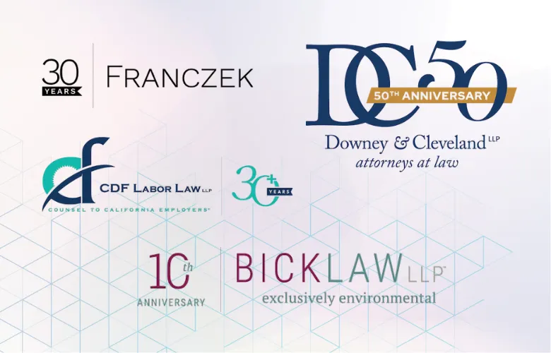
Traditional legal logos rely on visual elements like serif fonts, dark colors, monograms, scales of justice, pillars, and courthouse imagery. For some firms, such as corporate lawyers or estate planners, traditional branding communicates authority and experience. The problem is that many firms use the exact same imagery and color choices, diluting the effectiveness of these logos. If your logo looks like every other law firm in your market, it becomes forgettable instead of reassuring.
In the last decade, modern logos have gained a foothold. Many firms are moving away from obvious legal symbols. In their place, they are using logos that are more distinctive and work better across websites, social media, and mobile devices. Modern logos rely on cleaner typography, minimalist designs, and simpler color schemes. When you move away from the traditional logo elements, the goal becomes balancing creativity with credibility.
Branding by Practice Area
Different practice areas often call for different branding styles. A personal injury firm may benefit from bold branding that conveys strength and urgency. Estate planning and family law firms often lean toward calmer, more approachable designs that help reassure clients. Business and corporate firms typically favor more sophisticated branding that signals professionalism.
Criminal defense firms present an interesting challenge. The branding needs to project confidence and authority without being gimmicky or overly aggressive. In every practice area, the best lawyer logos are the ones that align with the message you are trying to convey. A logo should reinforce the type of experience clients expect when they contact your firm.
Firm Size
The size of a law firm should also influence logo design. Large firms often favor conservative branding to project stability and institutional credibility. Boutique firms, on the other hand, usually have more flexibility to create branding with personality. In many cases, smaller firms benefit more from standing out than blending in.
Firms should also think about where they want to be in 5 or 10 years. A logo designed around a very narrow identity may become limiting as the practice grows or expands into new areas. Good branding should feel consistent with the firm’s current identity while still leaving room for long-term growth.
Common Mistakes in Lawyer Logo Design
Most poorly designed law firm logos are boring and rarely get a second look. There is a second group of logos that are not merely benignly bad. They actively harm the firms they represent. The most common mistakes in lawyer logo design include:
- Overused legal clichés like scales of justice, gavels, and courthouse columns that make firms look interchangeable.
- Excessively complex logos that become unreadable or distorted on websites, mobile devices, and social media.
- Generic stock-style designs that fail to separate the firm from dozens of similar competitors.
- Poor font choices or outdated visual styles that unintentionally make the firm look behind the times.
Many attorneys choose logos based on what they personally find impressive rather than what resonates with potential clients. Effective branding is not about appealing to the partners in the conference room. It is about creating trust and recognition with the people the firm is trying to attract.
The Importance of Simplicity
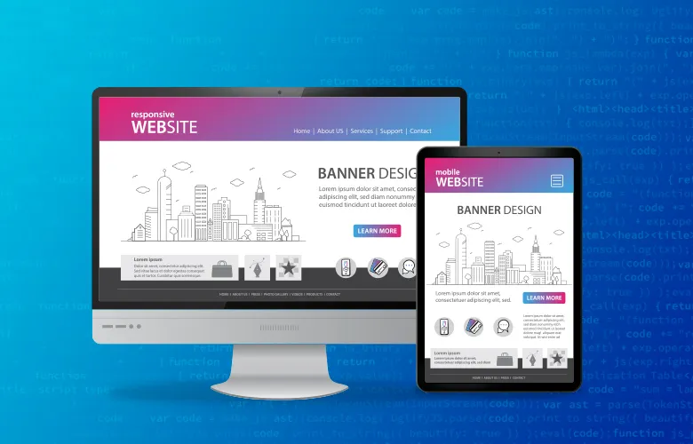
In the quest for the perfect logo, many firms overlook the fact that simplicity often yields the best results. Effective logos work across multiple formats and can be scaled to different sizes for different marketing media. In addition, the logo needs to be mobile-friendly. To be effective, logos should function well on:
- Websites
- Social media profiles
- Business cards
- Signage
- Advertisements
Complex logos may look impressive in a design mockup, but quickly lose their effectiveness when reduced to a social media icon or viewed on a smartphone screen. The best lawyer logos are usually the ones that communicate clearly, remain recognizable at any size, and still look professional years down the road.
Colors, Fonts, and Symbols Matter More Than You Think
Every design choice in a lawyer logo communicates something to potential clients. Blue often signals trust and professionalism. Black and gray tend to project sophistication and authority. Red can create a sense of urgency and aggressiveness, which may work well for some litigation or personal injury firms. Green is often associated with growth, stability, and financial or estate-planning practices. The same principle applies to fonts. Serif fonts often feel traditional and established. Sans-serif fonts tend to appear cleaner and more modern. Regardless of style, readability matters far more than trendiness.
Law firms should also think carefully before relying on standard symbols, such as scales, gavels, columns, shields, or monograms. While these can still work when firms are seeking a traditional image, they are so overused that they often make firms look interchangeable. In many cases, cleaner or more modern branding creates a more distinctive identity. Whatever direction a firm chooses, the logo, fonts, and color palette should work together across the website and the firm’s other marketing materials.
When Is It Time for a New Logo?
One of the goals of legal marketing is to build a brand that becomes more recognizable over time. Think about the classic Coca-Cola logo. That said, sometimes a partial or total rebrand is necessary. These are events and signs that indicate it may be time for a redesign:
- Branding that looked modern 10 or 15 years ago is making the firm appear outdated
- Mergers and firm name changes requiring a new logo
- Expanding into new practice areas may require branding that better reflects the firm’s broader services
- Firms targeting a different type of client may need branding that aligns with the expectations of that audience
- Logos that do not display well online or perform poorly on mobile devices may need to be simplified
A successful rebrand does not always require abandoning existing brand recognition entirely. In many cases, the strongest rebrands preserve familiar elements while refining and modernizing the firm’s overall look.
Choosing the Right Logo Design
Law firm branding differs from that of restaurants, retail stores, or tech startups. A good legal logo should fit into the firm’s larger website, marketing, and business development strategy. It should also stand out in your market. Before hiring a designer or agency, firms should review portfolios. Avoid cheap one-size-fits-all logo generators, which often produce generic results.
At the end of the day, a lawyer’s logo is far more than decoration. It reflects the firm’s professionalism and the type of clients it hopes to attract. The best legal branding balances trust, clarity, and memorability while helping firms stand out in an increasingly crowded market. At PaperStreet, we work with law firms to create customized branding and website strategies designed to support long-term growth and recognition. Contact us today to design a logo as unique as your firm.
What you should do next . . .
We create law firm website designs. Well . . . actually we create stunning, professional websites that get results for our clients. Since 2001, PaperStreet has been helping law firms grow their legal practices.
Join our newsletter, where you will learn educational info on latest insights, tips and best practices.
Share:
About Us
Did you know more than 200 clients have worked with PaperStreet for more than 10 years?
Get a Free Website
Analysis and Consultation
Marketing Services