Every Page a Landing Page: Make a Good Impression With Search on Sub Pages
Our team is proud to launch its new web site. We decided to try a new tactic with our site – every page is a landing page.
Why Every Page as a Landing Page?
The reasoning is that search provides over 67% of our traffic to our site. Those visitors not only hit our home page, but hit every page imaginable on our site. Some hit the home page, some hit our logo page, some hit our support page. We had to provide a good user experience and instantly make a great impression.

Home Page Design vs. Sub Page Design
Most designers spend a ton of time on the home page of a site. For good reason, it is usually the entry page and sets the tone. However, 2/3 of our visitors may never see the home page! Wow. So their only impression of our site is the sub pages.
Traditionally, our sub pages have been solid, not great, but good. They focused the user on just text. Just the facts. Not very creative for a creative agency. So we decided to use the same text, but spice it up, as you would a home page.

Sub Page as Your Entry Page
If your home page is the entry into your site and you design that for a specific reason to impress and guide users into specific information, then why shouldn’t every page of your site do the same?
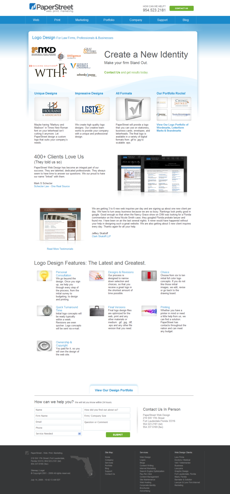
Why shouldn’t the user be provided with a unified design with a theme to the page? It just makes since. Instead of having the same sub page template (Logo, menu, small photo, and mostly text), we want to have imagery, lots of imagery, with focus on what is important – just like most home pages.
Did this take a lot of work?
Hell, yeah! Creating the format, layout, design and theme was pretty standard. We probably had the new format done in about 20 hours of design and 20 hours of CSS build. However, creating all the unique content, icons and imagery took forever. We probably doubled our time spent on the site and we already had everything written!
Does this look better?
Yes. We firmly believe the sub pages are better organized, better looking, and are pretty stylish. 🙂 Each one has a unique tagline, unique photo, focus on four key “Why Choose Us”, testimonials, unique features, and of course a call to action.
Will this Work?
I guess we will see in the next week or two. In the past 30 days we had about 100 inquiries (three to four a day). Let’s see if the new pages get higher conversions than our old text only sub pages. We will hopefully report back with numbers that are the same or higher.
What you should do next . . .
Join our newsletter, where you will learn educational info on latest insights, tips and best practices.
Share:
About Us
Did you know more than 200 clients have worked with PaperStreet for more than 10 years?
Get a Free Website
Analysis and Consultation
Marketing Services
