Designing for Conversions: Above the Fold Design & Call to Actions a Must
Get Your Most Important Information Up High
Your designs need to convert visitors into clients. How do you do that? Well – if we all knew the answer to that questions, I wouldn’t have a job.
- Have a goal.
- Have a clear message.
- Have a clear benefit.
- Have a clear call to action.
- Put it all above the fold.
Simple, but a lot of designs miss these factors.
Below are four sites that get it right. These are great examples of designs that were meant to convert. Our design team wireframed them (albeit quick and dirty) to showcase how simple the designs really are.
Again, the beauty is in the details – art and message – not the layout.

Mailchimp Design

MailChimp Wireframe
2. Base Camp

BaseCamp Design

BaseCamp Wire Frame
3. Rackspace

Rackspace Design

Rackspace Wireframe
4. Freshbooks

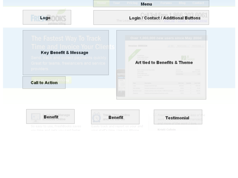
Freshbooks Wireframe
So, What Do These Have in Common?
These four sites were designed to get you to do something. Their design is not supposed to be award-winning, it is supposed to convert. As you can see, each site had the basics above the fold:
- Logo
- Menu
- Action Info (either contact information or a sign-up button)
They also have the following, which make them great sites:
- Call to Action – the part that tells you to do something
- Key Benefits – the part that speaks to you as a human with a need
- Art – aesthetically pleasing
- Secondary Benefits (if space available)
What you should do next . . .

Lawyer, geek & father of twin girls and a boy, who chose the path of starting a web design & marketing company.
Join our newsletter, where you will learn educational info on latest insights, tips and best practices.
Share:
About Us
Did you know more than 200 clients have worked with PaperStreet for more than 10 years?
Get a Free Website
Analysis and Consultation
Marketing Services