Can Your Law Firm Be Too Creative? – 5 Sites That Push the Boundaries
PaperStreet is known for our awesome creative websites; it’s one of the main reasons clients come to us instead of our competition. But is there ever such a thing as a law firm website that’s too creative?
Creativity can come in many forms with online marketing. It can be the innovative animation which brings the site to life, really wild and unique images that delight your eyes, or it could just be very catchy taglines that make you stop and think. Either way, it’s imperative that creativity enhances the user experience and contributes to the end goal rather than hindering or detracting from it.
Here are 5 Websites that Push the Creative Boundaries (and do it successfully)
Bicklaw LLP

Bicklaw is our creative champion, marrying a very cool concept with unprecedented unique photos and clever taglines. This site certainly broke out of the legal website norm, so it’s no wonder it was nominated for the prestigious Webby Award. It’s important to note though that this client practices environmental law and was primarily intending to impress their visitors, making the inspiring animal theme appropriate for them.
Struble P.A.

Struble is an excellent example of the design itself being on the creative edge. The angles and imagery placement aren’t just aesthetically pleasing, but they give a nod to the firm’s branding. Lawyerist.com recognized Struble.com as one of ten of the best websites of the year – a very distinguished award!
They said that the site “highlights some subtle and progressive design elements we love. The animation during loading is eye-catching and nicely implemented without bogging down the overall page speed. The large firm logo looks great, and we love the animation that fades it from prominence as you scroll.”
Thorpe Shwer

Thorpe Shwer is another site that shatters the legal marketing mold. The use of unexpected symbolic images that subtly grow on the home page represents the firm’s particular attention to detail. The Davey Awards must have agreed and recently honored the site design. Thorpe Shwer wasn’t afraid to be different, rather, on the contrary, they requested it and welcomed it with open arms. How often do you see a large succulent on a law firm website, right?
Searcy Latino
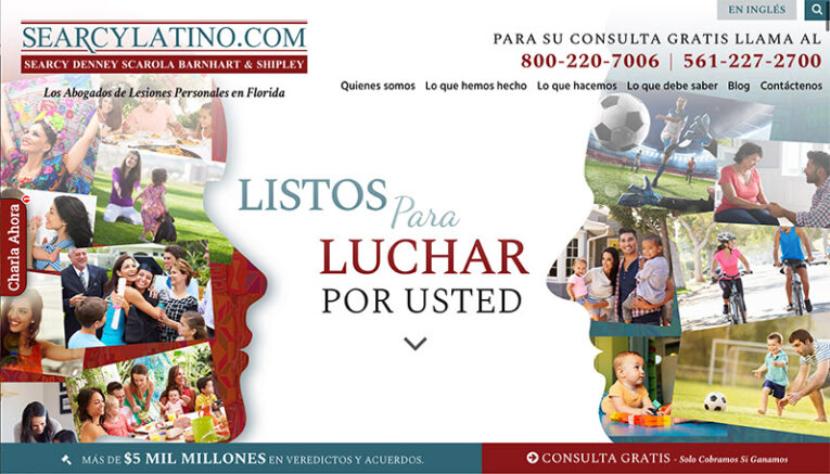
Here’s a great use of suitable and purposeful creativity coming into play. The goal of Searcylatino.com was to connect with their Hispanic audience deeply and do that, we need to speak their language visually. Bright, colorful patterns along with images of family and friends, quickly connects you to the heart of Latin culture. Loading animation on the homepage evokes a sense of vitality. It’s fair to say that this wouldn’t be a fitting creative route for most of our clients; however, that’s where PaperStreet’s marketing strategy is vital.
Kaplin Stewart

Creativity has the power to make a lasting impact, and we did just that with Kaplaw.com. This website features abstract architectural imagery along with poignant messaging and symbolic animation to drive one very important point home: “We Handle Every Angle of Business Operations.” We can’t say we’re surprised that Kaplaw won a gold AVA Digital Award for outstanding design.
The main takeaway is that creativity can be a key component of a successful website, so long as it’s expressed in a way that’s relative to your end goal. Here at PaperStreet, we take into account each of our client’s objectives and then push the boundaries appropriately, which results in a highly-effective awesome website.
Does your website need more creativity?
Please contact us for a free proposal to see how we can help your law firm create a unique, one-of-a-kind website that gets noticed.
What you should do next . . .
Join our newsletter, where you will learn educational info on latest insights, tips and best practices.
Share:
About Us
Did you know more than 200 clients have worked with PaperStreet for more than 10 years?
Get a Free Website
Analysis and Consultation
Marketing Services
