Best 15 Law Firm Logo Designs of 2026

We all know a great logo when we see it. A logo can set the tone for the law firm. It can be stylish, professional, eye-catching, and memorable. Here is our best logos list of 2024.
What Makes a Great Law Firm Logo
Simplicity
A good logo is simple, easy to view, and easy to read. It’s crucial that names and text included in the logo are legible from the moment you see them. Any illustrations that are not intended to be abstract should also be quickly recognizable
Innovative / Memorable
A good logo is innovative and something you have not seen before. If your logo is innovative, it has a better chance of being memorable, which is the whole point of having a good logo.
Colorful
There are countless posts about color theory. Suffice it to say, color matters. Here are some examples of color in basic formats.
White = Purity
Black = Luxury
Blue = Leadership
Purple = Royalty
Green = Health, Nature
However, these days, you can use even more colors. You will see red, yellow, and even pink on our list. Find a color that stands out and separates you from the competition.
Suggestive
The final step in having a good logo is making sure it suggests or aligns with your services. Sometimes, this is tough to do, but if you can, it will separate your firm.
Best 20 Law Firm Logo Designs

CanadianImmigration.com checks all the boxes. The logo is simple, innovative, memorable, and colorful, directly communicating what type of practice to expect. There is also nice symmetry achieved with the layout, a design principle people tend to gravitate towards.
The ABC logo is colorful and playful yet conveys a professional impression with a sophisticated serif font and typography. Creating balance was important, as letter blocks can lean too childish if not done right. We love it when we can make the unexpected happen!
When it comes to accident law, it’s crucial for potential clients to know exactly what the firm practices. This logo removes the guesswork and uses visual representation in a memorable and subtle playful way.
The Lincoln Law Firm uses a symbolic icon in their logo that conveys deep roots and a family tree, appropriate for a matrimonial practice. There is more of a traditional and elegant style that was intentionally created given the personality and reputation of the firm.
The Family and Fertility Law Group wanted a suggestive yet slightly organic feel to their logo. The icon alludes to the parent/child dynamic, and the colors intentionally have natural earth tones.
The IP firm of Dilworth wanted showcase its technology roots and propensity for innovation. The emanating circles represent growth and movement. The firm is proud of its ability to help its clients protect their cutting-edge ideas, which is shown in the logo.
Nyhan wanted to showcase their modern approach to law with something unique, positive, and different than the typical legal logo. They were proud to offer customized solutions for their clients and felt their brand needed to convey their innovation symbolically.
ESQGO has a very relevant business protecting Amazon sellers and e-commerce businesses. The logo needed to appear simple, streamlined, and strong. The pop of colors helps distinguish the “GO” from “ESQ,” and we love how effective it is.
Sometimes, the best logos are the simplest designs with a slight differentiating element. Here, we see the A and W connect with a line, creating a feeling of partnership and synergy. It’s modern, clean and timeless. These are often the most effective logos; Adhoot Wolfson is a PaperStreet favorite!
Property Damage Law Firm’s icon is effective with bright colors and a simple illustration to suggest buildings and homes. Users like to understand the practice with a quick glimpse and we achieve that here.

PiperPaul’s logo includes a monogram P that has a forward-thinking swoosh. Forward movement is helpful in conveying progress, advances and results in the right direction.
Getting into the payment market for lawyers is tough. Lexcharge wanted to stand out with a colorful design and technology feel. Having the icon on an angle creates interest and gives a nod to the “L” and “C” in the business name.
Being a larger firm, Conroy Simberg went with a classic wordmark for the logo design. Subtle features like the “Conroy” emerging from the top line and the “Simberg” descending from the second line make this logo unique.
WhiteBird already had this bird image in its logo, but it was oddly placed and detracted from the firm name. When redesigning, our team purposefully integrated the illustration and the text so that the bird image enhanced the name and felt part of the logo as a whole.
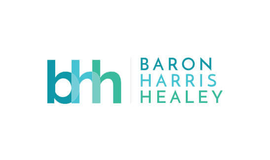
BHH is another PaperStreet favorite and is often referred to in our logo briefs by our new clients. People are attracted to the refreshing color variations of aqua, blue, and green and appreciate the modern non-lawyer feel they get from the overall design. It’s a great example of getting creative with just firm name initials and turning it into an eye-pleasing logo.
What you should do next . . .
Join our newsletter, where you will learn educational info on latest insights, tips and best practices.
Share:
About Us
Did you know more than 200 clients have worked with PaperStreet for more than 10 years?
Get a Free Website
Analysis and Consultation
Marketing Services


