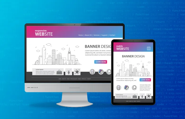
What Widths Should I Design For Responsive Design?
So you want to create a responsive website but don’t know what sizes you will actually need to design for. This is a common question. A lot of different devices can display your webpage, so should you design for them all?
Designing for all devices may be impossible as there are an infinite variety of devices that you can view a website on. When designing for a responsive site, it is best to consider what the majority of people are using and start there.
Top 4 Most Popular Widths for Web-Viewing Devices
The four most commonly used devices are:
- iPhone / Droid – 320px wide
- Small Tablets – 640px wide
- iPad / Tablet – 768px wide
- Computer – greater than 960px wide
You should consider the width of these three devices when creating a responsive website. However, keep in mind that you can design for many other widths such as iPhone sideways (480px). However, 320, 640, 768 and 960 are the four widths that are the most mandatory to design for when considering responsive design.
Helpful Tools for Testing Screen Width
Below are a few helpful tools to utilize when creating a responsive design:
- Test how your site looks on various devices with different widths
- Test how your site looks on various devices with different widths AND various browsers
- Convert your main navigation into a dropdown for mobile width
- Setting Up Divs For Responsive Web Development
- Why Responsive Web Design is Important
- Helpful photoshop grid for responsive design
If you are interested in talking more about responsive design or creating a website with the PaperStreet web design team, feel free to Contact Us today for a free consultation.
What you should do next . . .

Your website is the most important marketing tool you have for your business. Investing in quality code and marketing is the key to industry leadership.
Join our newsletter, where you will learn educational info on latest insights, tips and best practices.
Share:
About Us
Did you know more than 200 clients have worked with PaperStreet for more than 10 years?
Get a Free Website
Analysis and Consultation
Marketing Services


