How to Choose Accessible Colors for Your Website

Color is a big deal; it communicates personality, tone, and overall business branding. But it’s more than that: Color selection can also greatly impact website accessibility for disabled site visitors.
It’s all about readability. Poorly-selected colors can make text all across your site hard to read. Because content is at the core of any marketing strategy, hard-to-see content is a major problem to avoid.
The contrast between the colors on your website is what counts, specifically in the text like you’re reading now.
Need colors for your website and want to pick the right ones? Read on. In this post, we will cover tools for color selection, and, importantly, describe how to test if you’ve chosen an accessible, ADA-compliant palette.
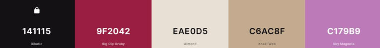
What’s in a Color Palette?
A color palette consists of several colors that you’ll use repeatedly across your website. There are no “right” or “wrong” colors; it’s an artist’s decision, or a business owner’s call. As we will see later, it is the relationship between the chosen colors that matters.
Google’s color picker shows us that colors can be expressed in many ways:
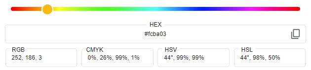
The most common representation of color on the Web is the hexadecimal code, or “hex code,” which is comprised of six symbols, like this:
Each symbol is either a 0-9 or a letter, a-f.
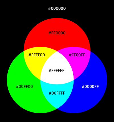
A pure white is #ffffff. A regular ol’ blue is #0000ff. Meanwhile, the endless shades in between leads to more complicated-looking combinations, like #fcba03.
Now, just how many of these do we need?
The Colors You Want
A website demands more than just a single color. As a guideline, we want the following:
- Primary color – Usually taken from your branding and logo, this color will be used frequently on the website, be it on buttons, links, borders, and more.
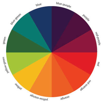
- Secondary color – A second color that complements the primary color. Useful for alternate buttons, hover states on links, and solid background sections, it could also be taken from your logo. Either this color or the tertiary color should offer significant contrast from the primary color. Perhaps a warm (red/orange/yellow) primary is offset with a cool (blue/green/turquoise) selection.
- Tertiary (“accent” or “trim”) color – Used less frequently, this color can be mixed into any of the aforementioned places to add variety.
- Light color – Often a gray like #eeeeee, this can also be a light, reduced-saturation version of your primary or secondary color. It will be used to create sections, or blocks of content, that will also work with the dark body text on top
The All-Important Body Text
The last color happens to be the most crucial for accessibility and compliance. It’s the body text color. The color of the very text you are reading at this moment.
“That’s just black!” you might respond.
Wrong. (Sometimes.)
Recall our hex codes. Black is #000000. Six zeroes. Pure nothingness.

Some websites – many websites – do use actual black for text. It works! It provides strong contrast! But it’s also plain, and, arguably, hard on the eyes for extended reading.
The truth is that text can be readable – or legible enough, with suitable contrast depending on the background – in many dark shades.
And it happens that a touch of color in the body text, even subtle color in the near-blackness, can convey an extra stretch of personality and differentiation your brand desires, all while being softer on the eyes.
A vast majority of websites use a dark-on-white scheme: That is, near-black text on top of a light-ish background. You could also go the other way, picking a dark color background for your website with light text on top of that.
The one requirement is that the chosen text color provides enough contrast with the chosen background color. That’s it. Beyond this rule, it’s all creativity.
For starters, we recommend a near-black color on white. Some highly usable hex code options for near-black-but-not-pure-black-and-with-a-touch-of-color include:
- #0d160b is a near-black with the slightest touch of green, a high-contrast choice
- #414042 is on the lighter side, more a “dark gray” than black, plus a tinge of purple
- #0c323c is another “dark gray,” this one with a dash of blue
Color Palette Generation Tools
There are many free tools that can help you find color inspiration. Our top recommendation is Coolors, for its simplicity and presentation.
Once on the Coolors website, locate the color generator. If you see five colors filling your screen, you are in the right place. A press of the spacebar swaps out the colors with an all-new set.
When you find a color you like, lock it, then generate more colors to go along with that.
If Coolors doesn’t help, other great tools include:
- Adobe Color (https://color.adobe.com/), which includes different color wheel setups and built-in accessibility tools to check contrast. A powerful tool that only loses points due to its more complex nature.
- Colormind (http://colormind.io/), where a fresh AI-generated palette can be generated with a click. Easy-to-use inspiration!
The other way to pick colors, of course, is to hire a talented design team like PaperStreet. We’d love to personalize your branding for you.
Contrast is Key for ADA Compliance
Now that we have colors, it’s time to ensure they have enough contrast. To do this, we recommend a tool like “Accessible Colors” (https://accessible-colors.com/) or the WebAIM Contrast Checker (https://webaim.org/resources/contrastchecker/), both excellent options.
Color contrast can be boiled down to raw, quantifiable numbers. This makes it easy to measure acceptable vs. unacceptable contrast.
Contrast Ratio Basics
Given a pair of hex code colors, a test will return a contrast ratio. As mentioned, the colors we want to test are:
- A text color
- A background color that text will sit on top of
The resulting contrast ratio can be thought of as the difference between the two colors. If the delta, or difference, is wide enough – as determined by Web Content Accessibility Guidelines (WCAG) – then the contrast is said to be ADA compliant. That’s the stamp of approval we want.
So, just how much contrast is enough?
- A ratio of 4.5:1 for normal text
- A ratio of 3:1 for large text (heading size)
Notice the difference in these two requirements. Large text requires less contrast because the text will literally appear larger and thus easier to read on-screen, regardless of color.
Run Your Tests
Without a doubt, the first contrast test to conduct is for the main content section or “body content” of your website. In this blog, the body content is what you are reading now. The color of the paragraph text in this section compared to the color of the background it sits on top of is the essential contrast test to perform.
For example, using a dark color we mentioned earlier, #0d160b, let’s test that on white:

It passes with ease (flying colors?)! A ratio above 10 when we only needed 4.5.
Next, test other colors you want in your design.
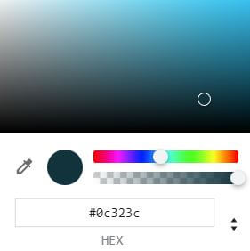
If your headings/titles will use a secondary color, say, #51b6e6, also on white, let’s test that:
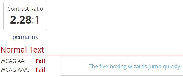
Not enough contrast! What to do now?
If the background is light, as in this example, either:
- Darken the text
- Lighten the background further
If the background is dark:
- Lighten the text
- Darken the background further
So, let’s drag our color picker to make it darker:

The hex color we landed on, #187dae, tests perfectly.

A neat feature, the Accessible Colors website provides immediate color alternatives in the event a test doesn’t pass.
The goal is to land on a color palette where all different color combinations that will occur on your website meet the specified ratios.
If you struggle, even in the slightest, to read your content on the web, someone else will struggle more. The text probably lacks sufficient contrast. Test and adjust.
Accessibility is a Process
Achieving good accessibility on your website is an iterative process, and you might not have it right the first time. Nonetheless, the fundamental choices we make, like picking colors, can greatly determine the readability of everything in your content. So respect your user, strive for accessibility, and choose those colors wisely.
If the above is too daunting, however, PaperStreet takes pride in our design awards and our expertise in ADA compliance. Schedule a free consultation with us and we’ll outline what your site needs to maximize accessibility for all of your potential site visitors.
What you should do next . . .

Mike is a lifelong Floridian who loves all things tech and biz. He writes on the latest happenings in technology, website best practices, and accessibility.
Join our newsletter, where you will learn educational info on latest insights, tips and best practices.
Share:
About Us
Did you know more than 200 clients have worked with PaperStreet for more than 10 years?
Get a Free Website
Analysis and Consultation
Marketing Services


