ADA Compliance Help: Can I use text on top of a background image?

Much like buildings, websites have certain laws and guidelines that must be followed to maintain compliance. The Americans with Disabilities Act (ADA) was passed in 1990, which did not specifically address digital accessibility or websites in general. However, the Department of Justice (DOJ) has stated that websites qualify as “places of public accommodation”. This means that all websites must comply with the law and follow standard practices for accessibility.
According to the Center for Disease Control (CDC): “Vision disability is one of the top 10 disabilities among adults 18 years and older and one of the most prevalent disabling conditions among children.” Since vision disabilities are so common, as website builders and designers, we need to be conscious of using appropriate foreground and background colors that comply with color contrast standards. As such, you may be wondering: “Is it possible to place text on top of images and still be ADA compliant?” While it may depend heavily on the specific colors and images used, the answer is yes; it is possible to have text on top of an image and still be ADA compliant.
Breaking Down Minimum Contrast
The Web Content Accessibility Guidelines 2.0 (WCAG) states that all large text (18 point text or 14 point bold text) must have a color contrast ratio of 3:1, and small text should have a ratio of 4.5:1. Providing a minimum contrast ratio between text and its background can make the text more readable for a person with a color vision deficiency.
If you are unsure if your text color is not compliant with the background color, here are a few tools you can use to check the color contrast:
The above tools are used to check color contrast of text on top of a solid color background; adding a background image to the mix makes compliance a little complicated. An image can have thousands of pixels which can include a multitude of colors. For text to be compliant, each letter must be checked against the specific color pixels behind the text. This can be an extremely tedious process for any typical background image, but luckily we have another tool to speed up the process:
This handy tool allows us to upload an image, add text, position the text, and update the font size we want to test. Using the WCAG 2.0 contrast ratio formula, this tool scans eight different colors that appear behind the text and verifies the contrast ratio against four criteria. The criteria we are primarily concerned with is Level AA compliance as this is the general minimum requirements for color contrast. Here are a few examples of the scenarios we can encounter when using the tool:

- Full compliance – our test text meets all color contrast criteria at all font sizes.
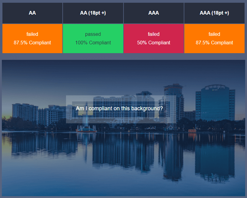
- Partial compliance – the text only meets the appropriate color contrast standards at a font size that is above 18pt.

- No compliance – the text fails to meet any criteria and so the color must be updated.
Overall, it is possible to use text on top of background images but we must be cautious with which color text and font sizes we are using against the background. Since there are a wide range of visual disabilities a person can have, we should try our best to meet at least the minimum color contrast requirements to provide a good user experience.
What you should do next . . .

Nature has form, function and color in abundance. It is a hands down winner for supplying inspiration.
Join our newsletter, where you will learn educational info on latest insights, tips and best practices.
Share:
About Us
Did you know more than 200 clients have worked with PaperStreet for more than 10 years?
Get a Free Website
Analysis and Consultation
Marketing Services