50+ Best Practice Area Landing Pages for Law Firms – Get Creative! (2026 Update)
Creating the Best Practice Area Landing Pages for Your Law Firm
A practice area landing page is a key navigation hub within your website, designed to help potential clients quickly understand what your firm offers and find the right path forward. These pages play an important role in building trust, clarifying services, and encouraging users to take the next step toward contacting your firm.
A strong practice area landing page does more than list services—it organizes information in a way that is clear, intuitive, and visually accessible. Whether using structured grids, simple lists, interactive expand-and-collapse sections, or image-driven layouts, the goal is to make complex legal services easy to understand at a glance. When visitors are often stressed or uncertain about their legal situation, clarity and ease of use become essential.
Effective design is clean and purposeful. The strongest practice area landing pages balance visual interest with simplicity, avoiding clutter while still guiding users through your services in a meaningful way. Thoughtful use of spacing, hierarchy, and modular content helps ensure users can quickly scan and absorb information without feeling overwhelmed.
There is no single formula for success. Practice area landing pages can be bold and visually rich, or minimal and straightforward, as long as they reflect your firm’s brand and speak to your target audience. Some pages rely on imagery, storytelling, and interactive elements, while others use simple structured lists or grids to present information efficiently. The most effective designs focus on connection—making it easy for users to understand your services and feel confident reaching out.
Need a Landing Page? We Offer Free Consults.
Let’s talk about how we can design a practice area landing page that clearly showcases your services and turns more visitors into clients.
Portfolio of Best Practice Area Landing Pages
These are all practice area landing pages we designed to help law firms better organize their services, improve clarity, and convert more visitors into clients. Each of these was created by our creative team and coded by one of our developers – real humans who do good work. Explore some of our best practice area landing page designs for inspiration as you consider how to structure your firm’s website.
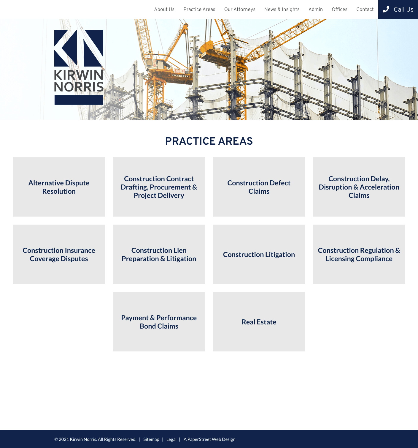
#1. Kirwin Norris
Plain boxes present practice areas in a clean, card-based layout that emphasizes clarity and makes each service easy to scan.
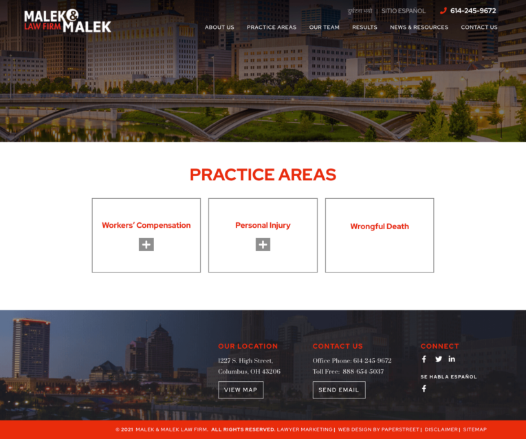
#2. Malek & Malek Law Firm
Expand and collapse boxes use an accordion design that lets users reveal detailed information only when they choose to engage with a specific practice.
#3. McKinley, Conger, Jolley & Galarneau, LLP
Expand and collapse boxes in a list format organize multiple accordion sections in a structured vertical stack that improves navigation through dense content.

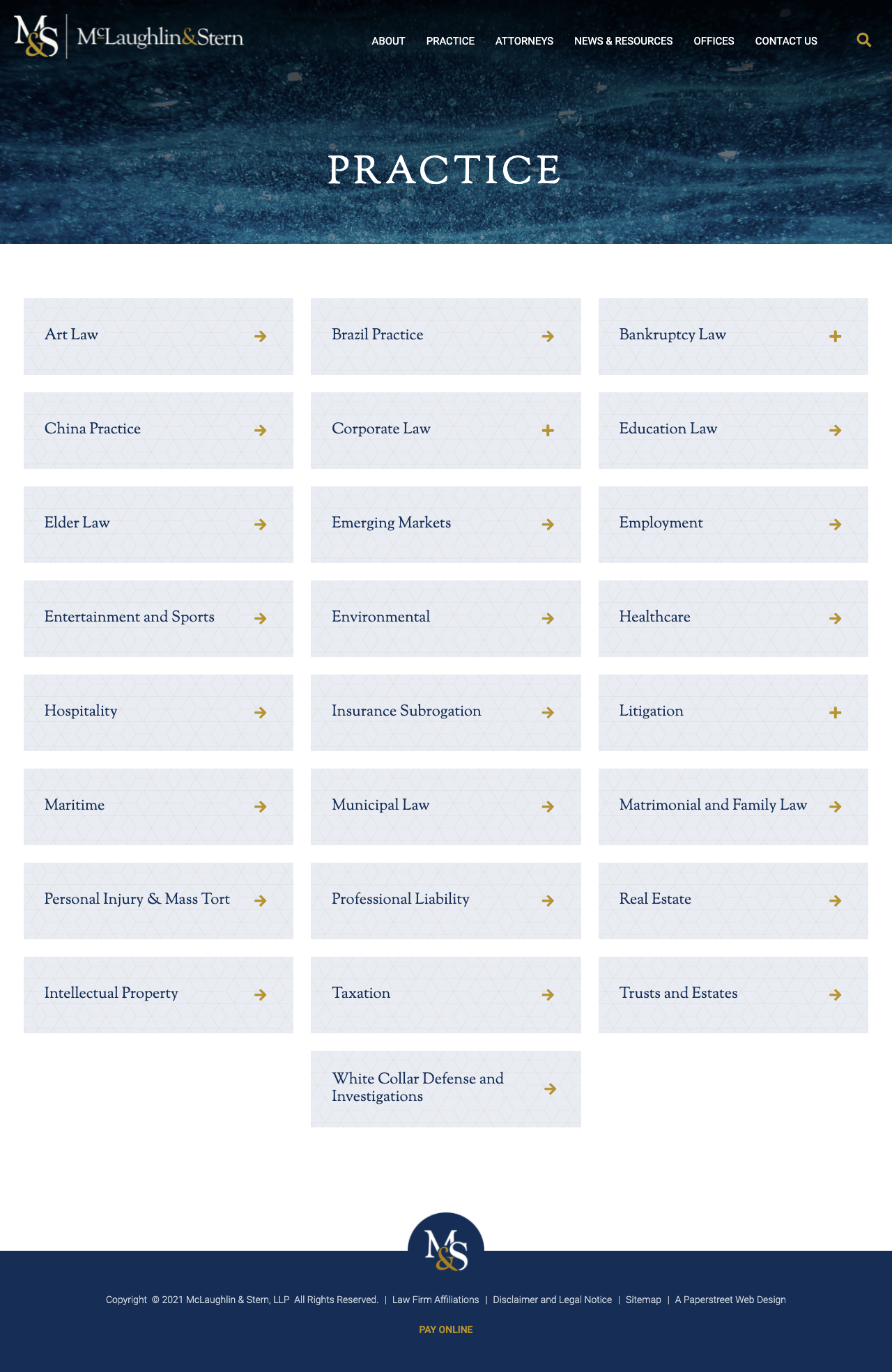
#4. McLaughlin & Stern, LLP
A grid for organizing a large list of practices uses a multi-column layout to efficiently display many offerings while maintaining visual balance and order.


#5. MyProbateCase.com
A pricing grid for different pricing levels compares service tiers side-by-side, making it easy for users to evaluate options at a glance.

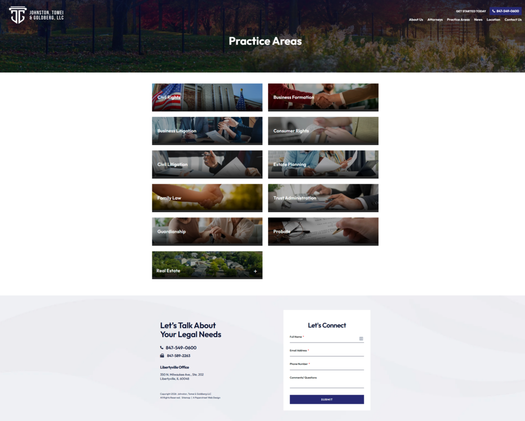
#6. Johnston, Tomei & Goldberg LLC
Images and boxes combine visual storytelling with structured content blocks to create a more engaging and context-rich presentation of practice areas.
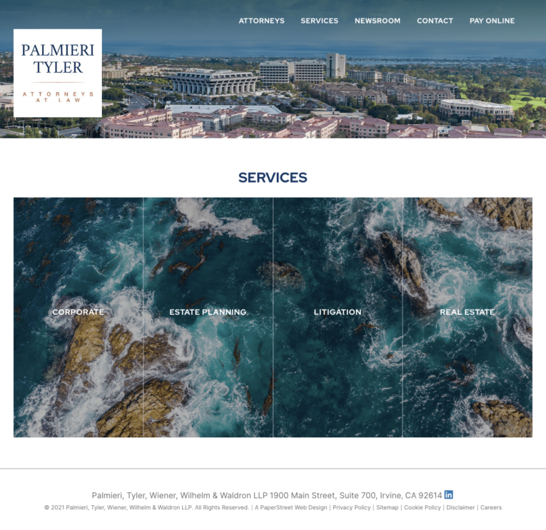
#7. Palmieri, Tyler, Wiener, Wilhelm & Waldron LLP
A creative layout breaks a single image into four connected practice boxes, using a split-visual concept to unify branding across multiple services.

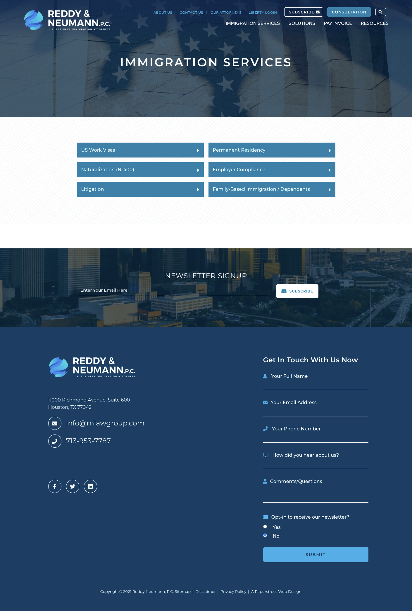
#8. Reddy Neumann, P.C.
Plain boxes return to a minimal, modular card system that keeps the focus on concise, easily digestible practice descriptions.
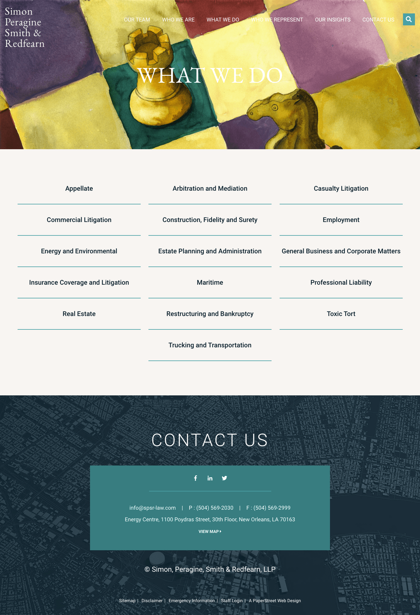
#9. Simon, Peragine, Smith & Redfearn, LLP
An organized list with a featured photograph pairs a strong visual anchor with a structured list to guide users through the practice areas.
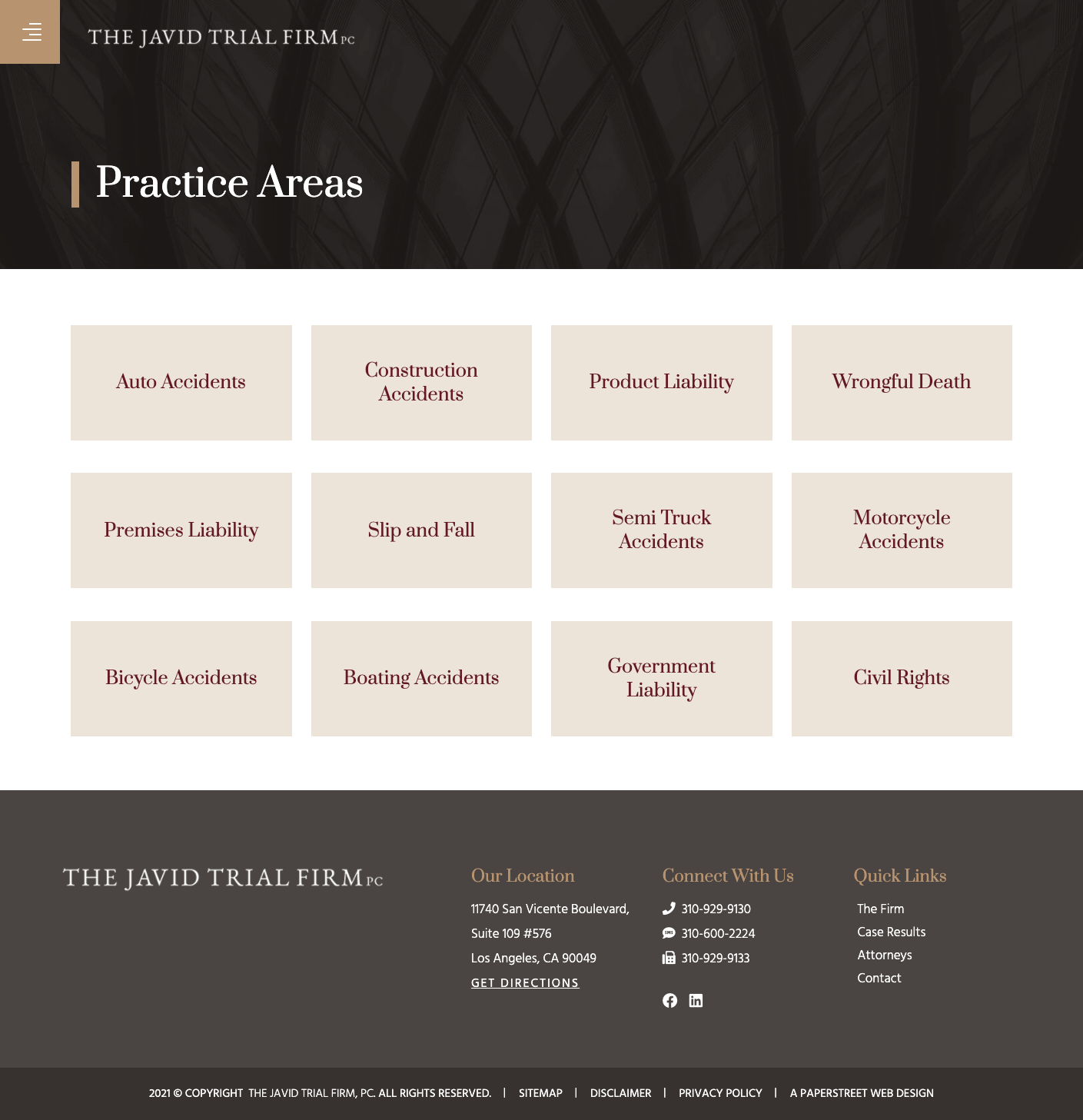
#10. The Javid Trial Firm, PC
Plain boxes maintain a consistent, streamlined card layout that supports readability and scalability across multiple practice sections.
Want a practice page like these?
We created them and can help you too.
Contact Us Today#11. Williams Parker Harrison Dietz & Getzen
An ordered list with a touch of color introduces subtle visual cues that enhance hierarchy while preserving a simple, professional structure.

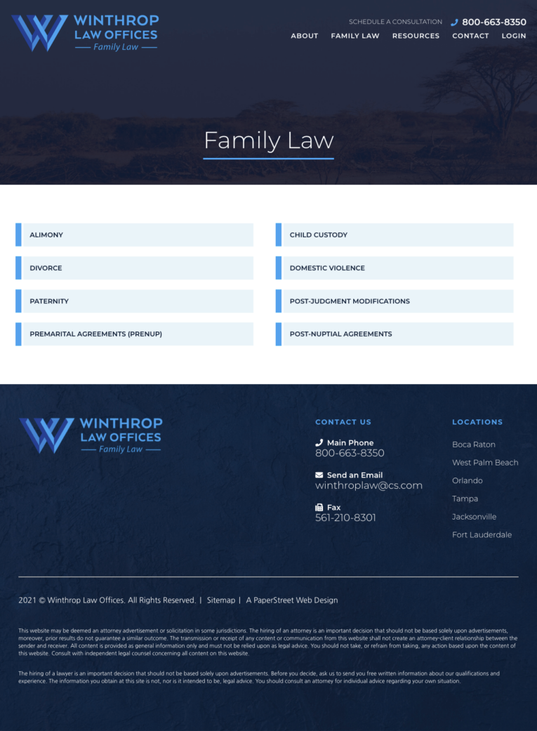
#12. Winthrop Law Offices, P.A.
Plain boxes continue to deliver a straightforward, uniform design that prioritizes content clarity and ease of navigation.
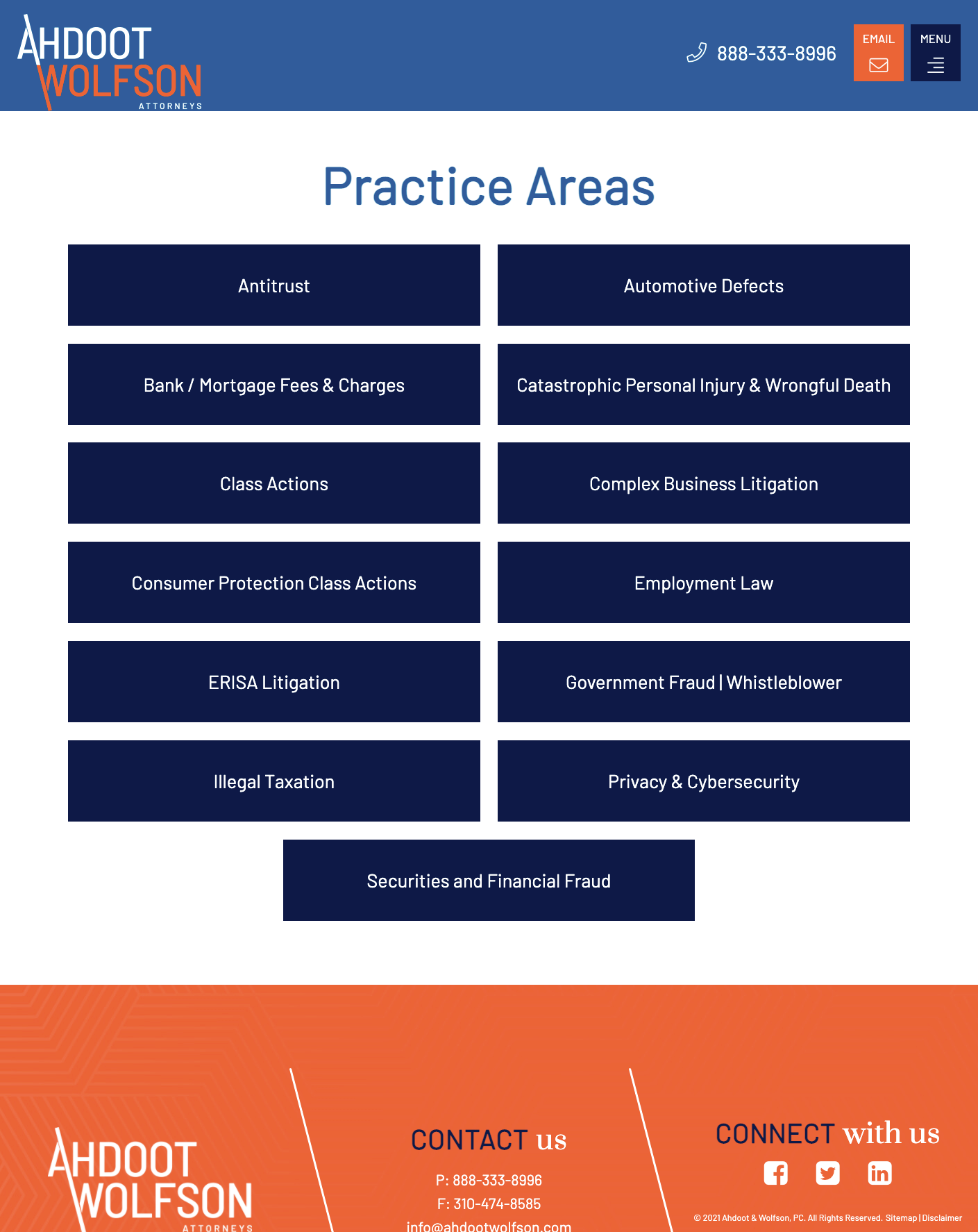
#13. Ahdoot & Wolfson, PC
Expand and collapse boxes provide an interactive experience that allows users to control how much detail they see within each practice area.
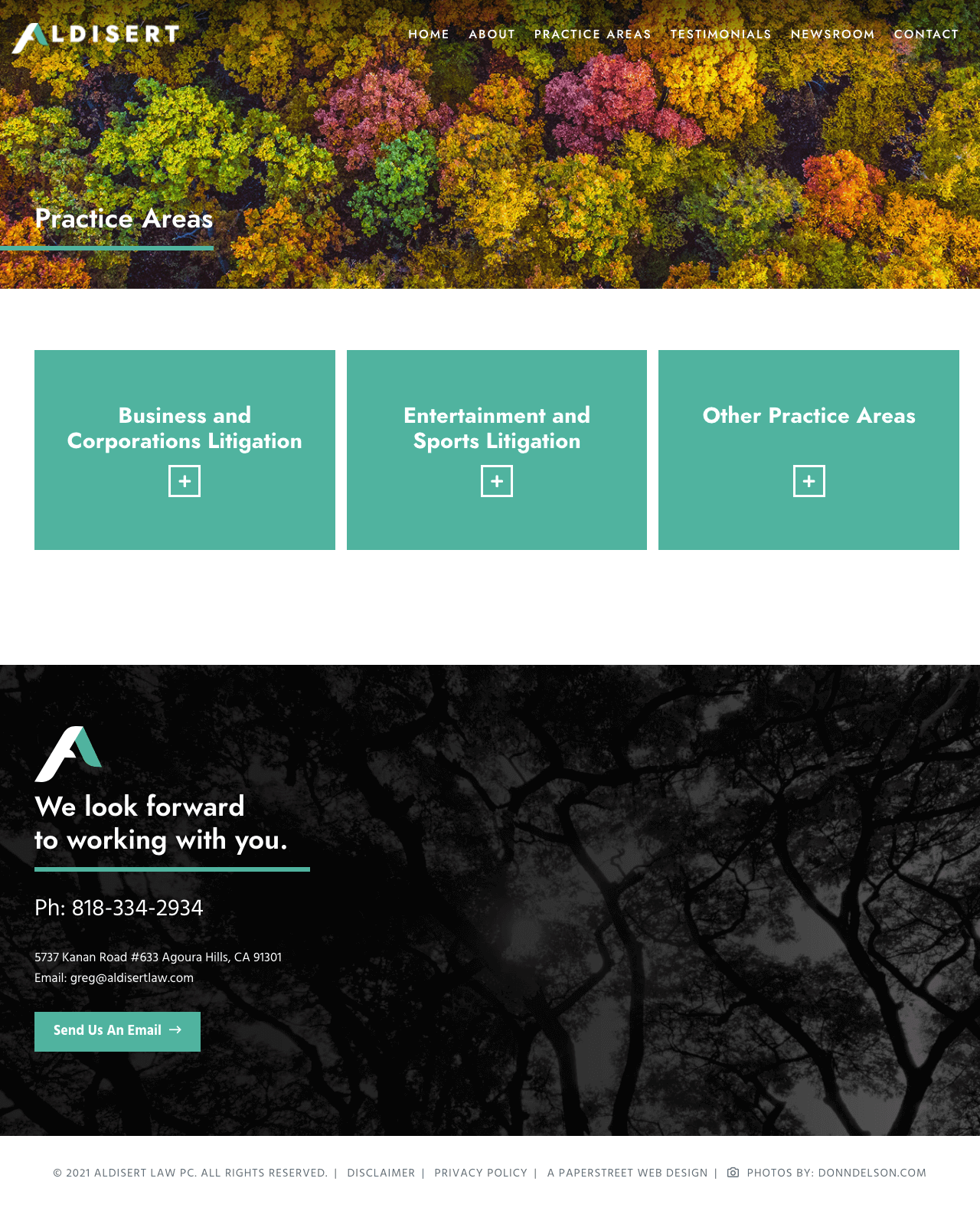
#14. Aldisert Law PC
Expand and collapse boxes with an opening narrative set context at the top of the section before guiding users into expandable, detailed content blocks.
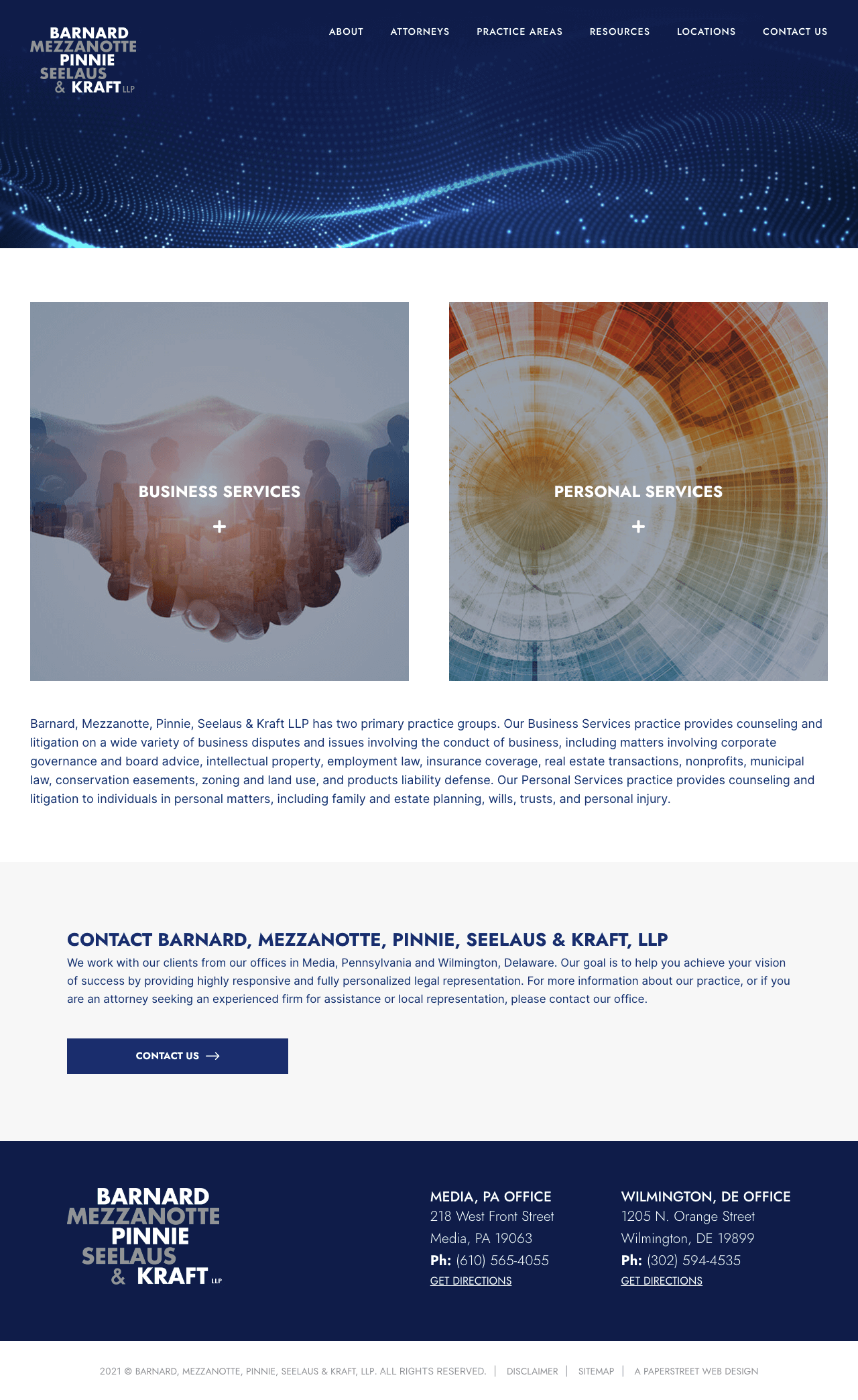
#15. Barnard, Mezzanotte, Pinnie, Seelaus & Kraft, LLP
Expand and collapse boxes maintain a structured accordion format that keeps extensive practice information organized and accessible.
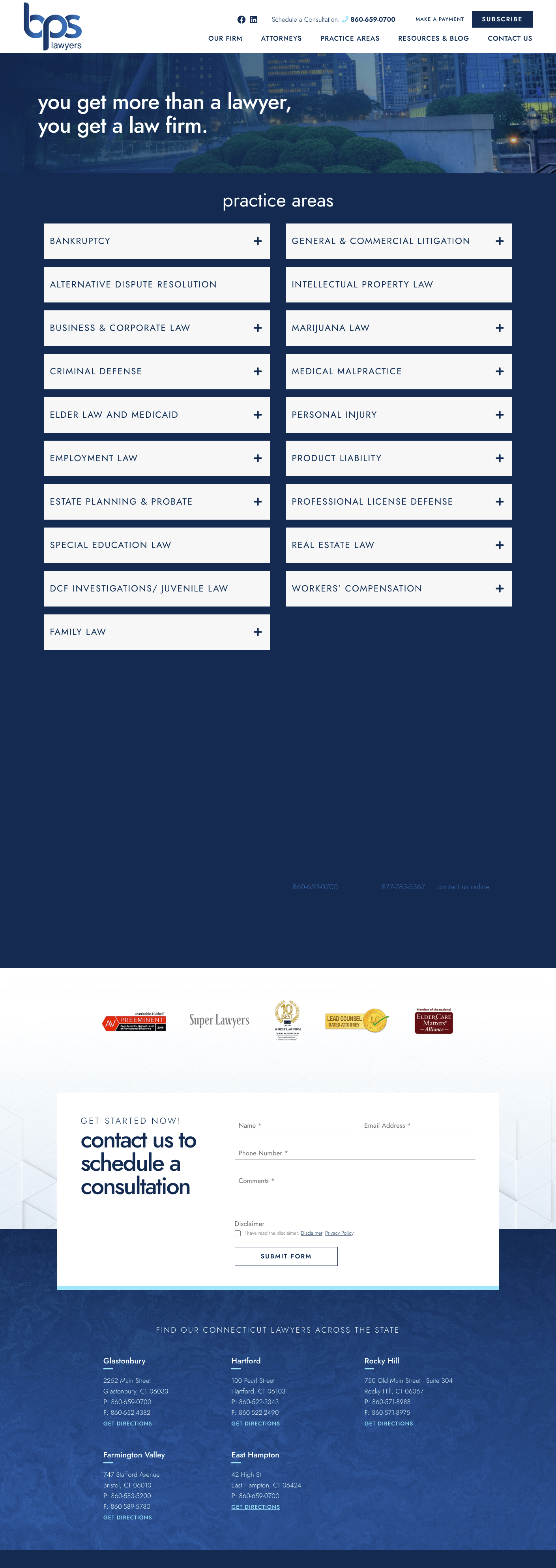
#16. Brown Paindiris & Scott LLP

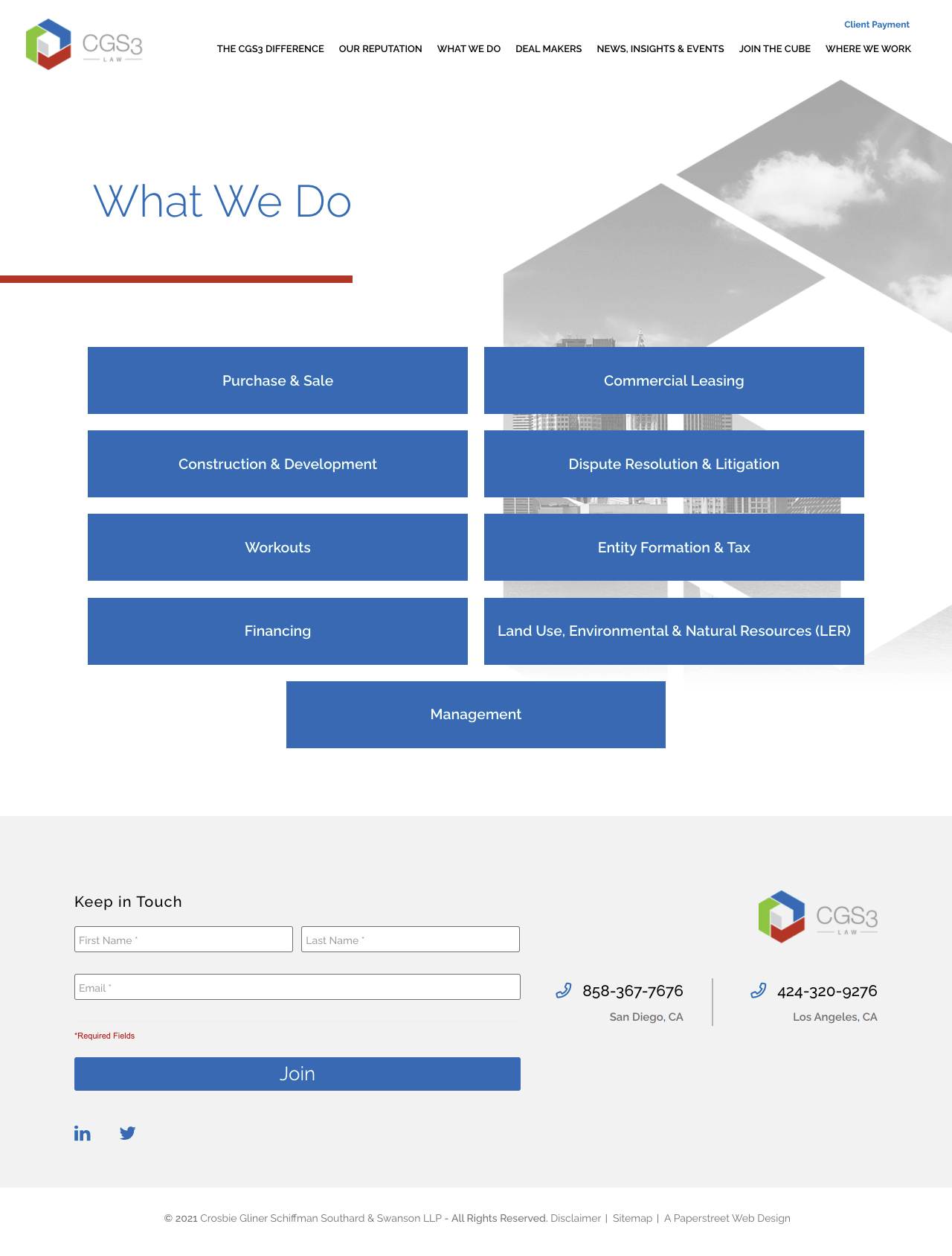
#17. Crosbie Gliner Schiffman Southard & Swans
A simple ordered list presents practice areas in a clean, linear format that prioritizes clarity and straightforward navigation.
#18. Daniel Coker
A simple ordered list again uses a structured, no-frills layout that makes it easy for users to quickly scan available services.

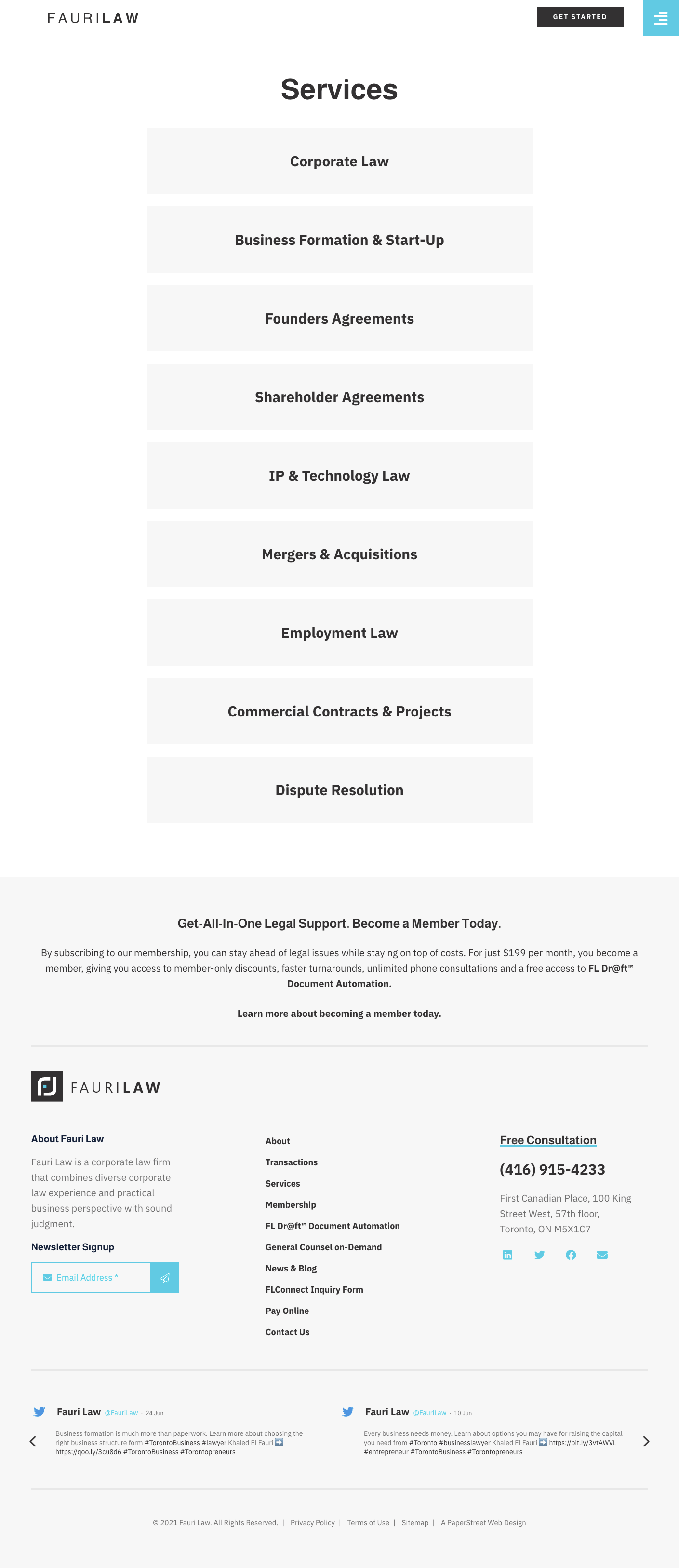
#19. Fauri Law
A modern example that uses white space relies on generous spacing and minimal visual clutter to create a clean, elevated, and easy-to-read design.
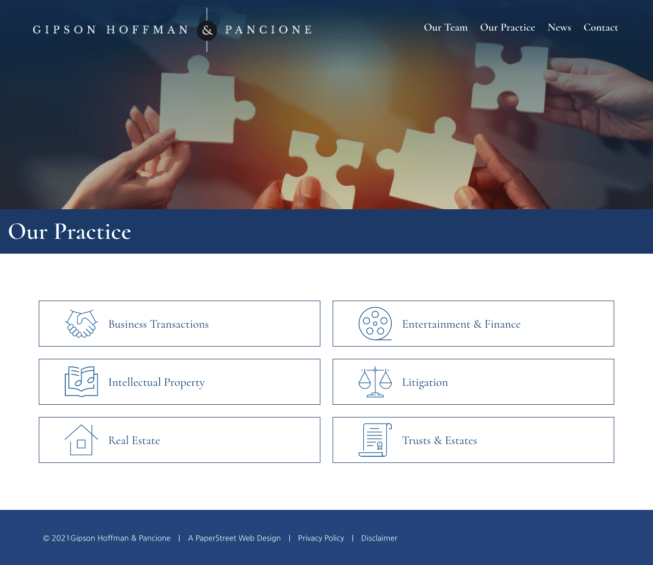
#20. Gipson Hoffman & Pancione
A layout that uses icons for visual representation pairs each practice area with visual cues that enhance comprehension and improve scanability.
Want a practice page like these?
We created them and can help you too.
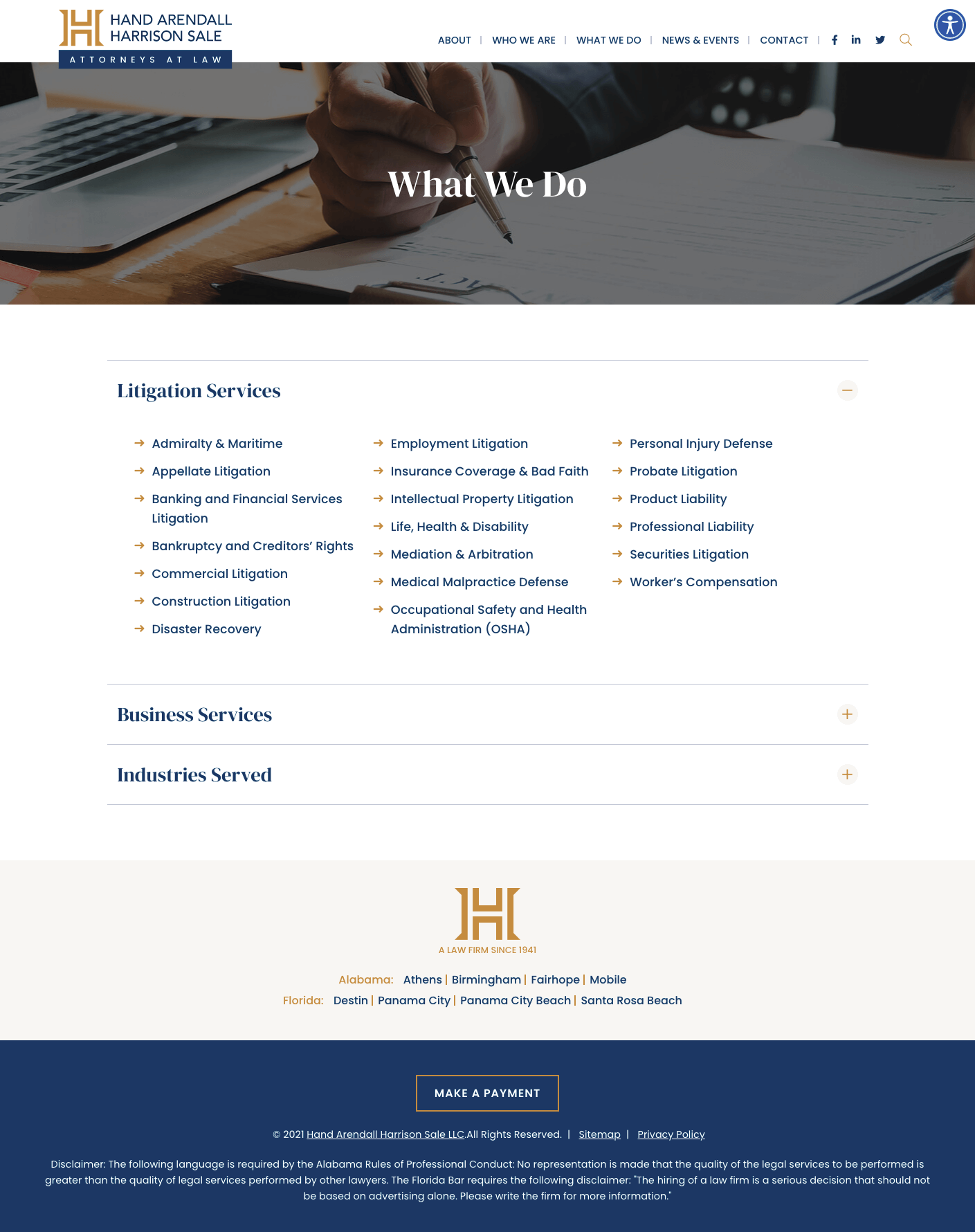
Contact Us Today#21. Hand Arendall Harrison Sale
A two-tier services layout breaks offerings into distinct audience groups, creating clear separation and helping users quickly find the most relevant path.
#22. Holden Willits PLC
Basic boxes use a simple card structure to group practice areas in a consistent and easy-to-digest format.

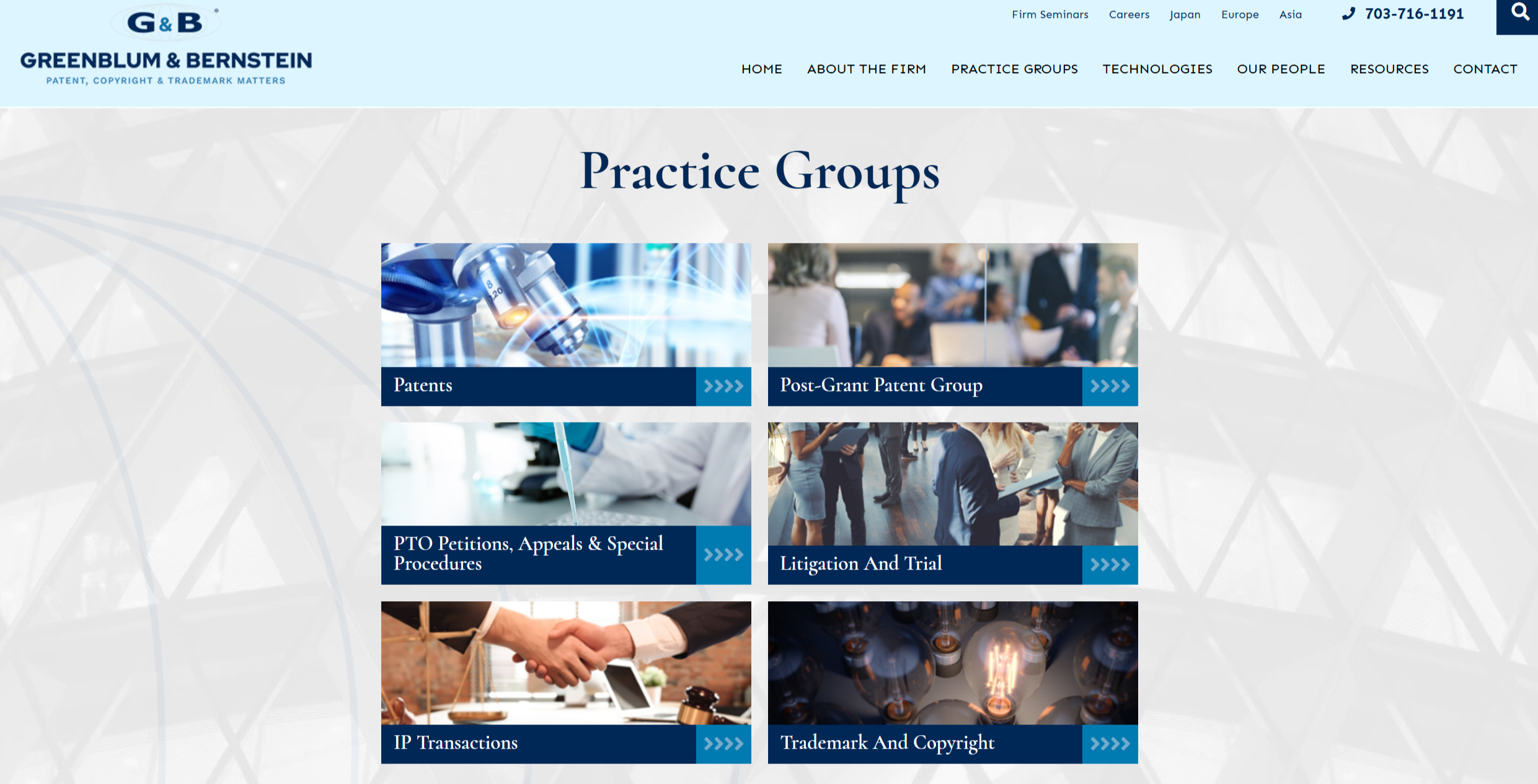
#23. Greenblum & Bernstein, P.L.C.
Images with practice names and a detailed hover rollover combine visual identification with interactive overlays that reveal additional information on engagement.
#24. Thorpe Shwer
Basic boxes but colorful maintain a simple card layout while introducing color accents to add visual interest and hierarchy.

#25. Kidneigh & Kaufman
A narrative-driven layout combines introductory storytelling with a simple icon-based list and an embedded video to create a rich, multi-format experience.

#26. Register Law
A featured narrative with images and a supporting list uses an opening story to frame the page while guiding users into structured practice area content.

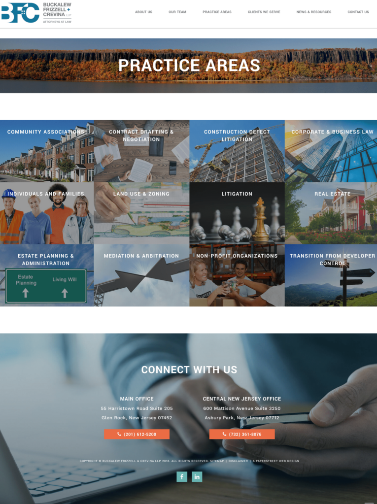
#27. Buckalew Frizzell & Crevina
A grid of photos with headers and no white space creates a bold, tightly packed visual layout that delivers a clean, high-impact presentation.
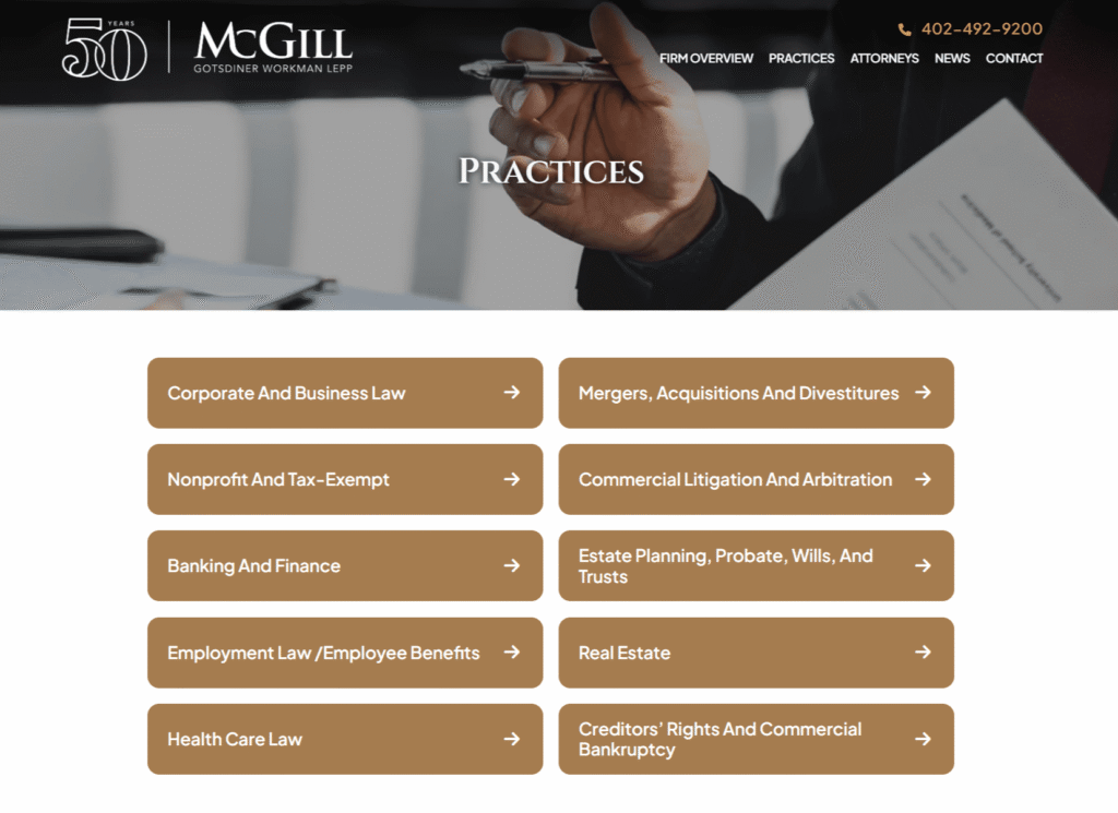
#28. McGill Gotsdiner Workman Lepp
Basic boxes continue to use a straightforward card-based structure that keeps practice areas organized and easy to navigate.
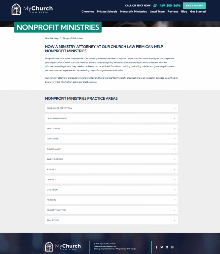
#29. My Church Law Firm
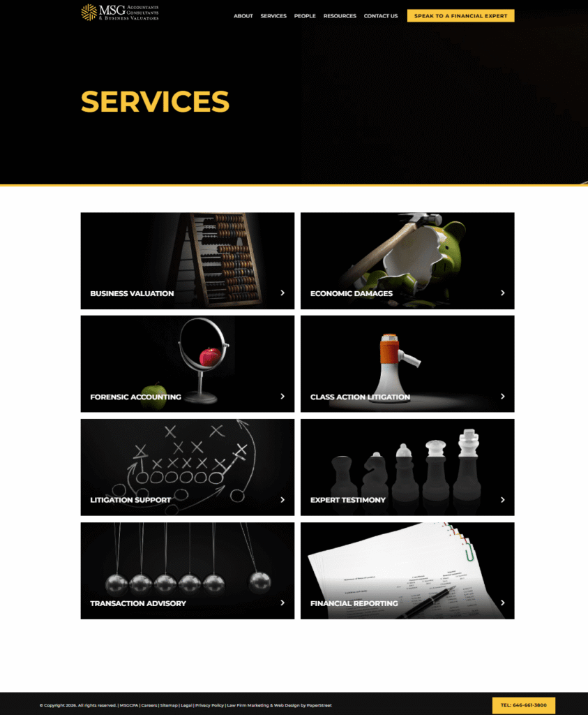
#30. MSGCPA
A dark layout combines strong contrast, imagery, and linked cards to interior pages, creating a visually striking and navigable practice area experience.
Want a practice page like these?
We created them and can help you too.
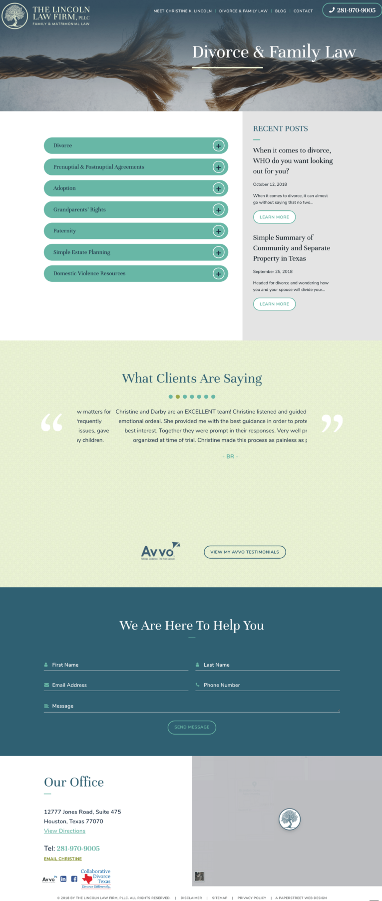
Contact Us Today#31. The Lincoln Law Firm
A two-column layout pairs expand and collapse boxes with a right-hand sidebar that highlights recent thought leadership for added context and engagement.
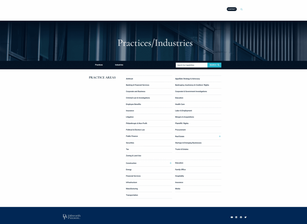
#32. Dilworth Paxson
A simple list presents practice areas in a clean, minimal format that prioritizes readability and straightforward navigation.
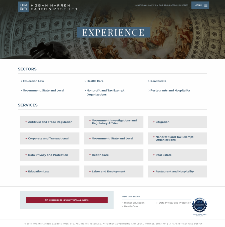
#33. Hogan Marren Babbo & Rose
A sector-based layout separates industries and practice areas into distinct sections, making it easier for users to navigate by category.
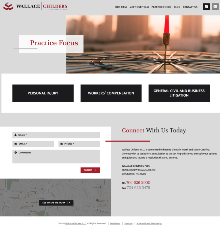
#34. Wallace Childers
A unique design approach reimagines simple boxes with distinctive styling and layout variations to create visual differentiation while maintaining clarity.
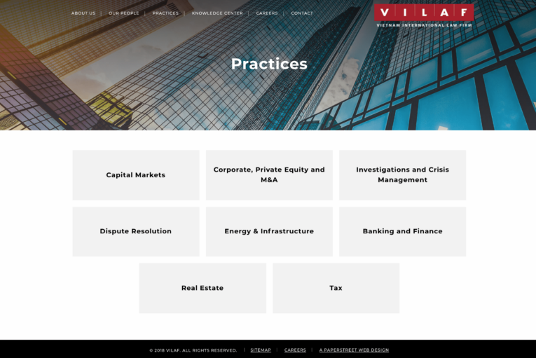
#35. VILAF
Simple boxes use a clean, consistent card format to present practice areas in an easy-to-scan structure.
#36. The Gumprecht Law Firm
Simple boxes again rely on a uniform card-based layout that keeps content organized and accessible.

#37. Lyons Dougherty
Simple boxes in a two-tier list structure group practice areas into hierarchical levels for clearer organization and navigation.

#38. VLP Law Group
A sector-division layout again separates industries and practice areas to help users quickly identify relevant content paths.

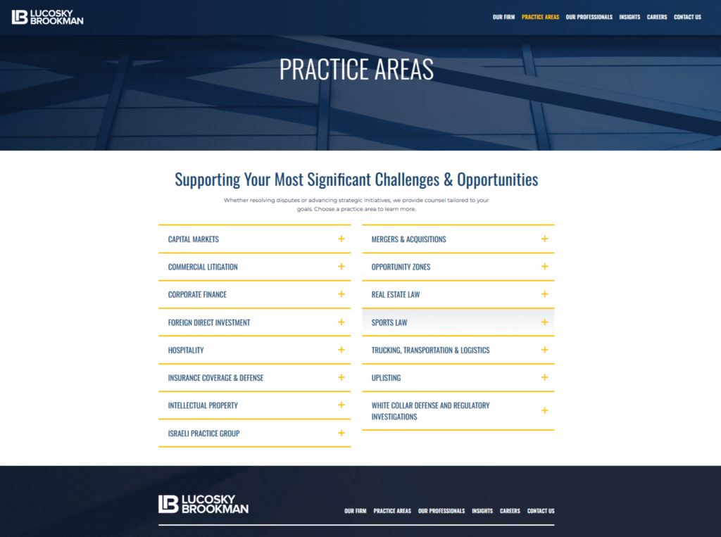
#39. Lucosky Brookman
Expand and collapse boxes in a two-column layout with a featured color introduce visual hierarchy while maintaining interactive content control.
#40. Kahana Feld
Photo boxes with expand and collapse functionality combine imagery with interactive content sections to create a more engaging browsing experience.
We created them and can help you too.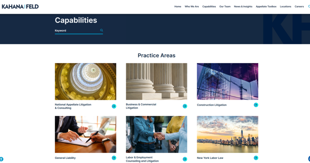
Want a practice page like these?
#41. Wilson & Franco
Boxes featuring related images enhance each practice area with supporting visuals that reinforce context and meaning.

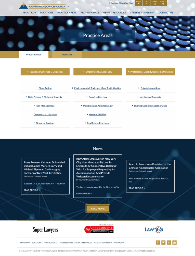
#42. Kaufman Dolowich
A tabbed layout separates industries and practice areas, highlights key services, and leads into an ordered list for structured navigation.
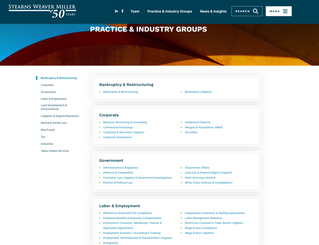
#43. Stearns Weaver Miller
Jump link navigation is used to help users quickly move through a large list of practice areas, improving usability and access.

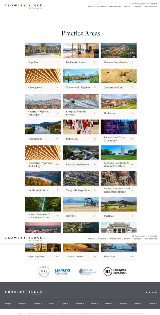
#44. Crowley Fleck
Featured imagery within each practice area box adds visual identity and strengthens recognition across service categories.
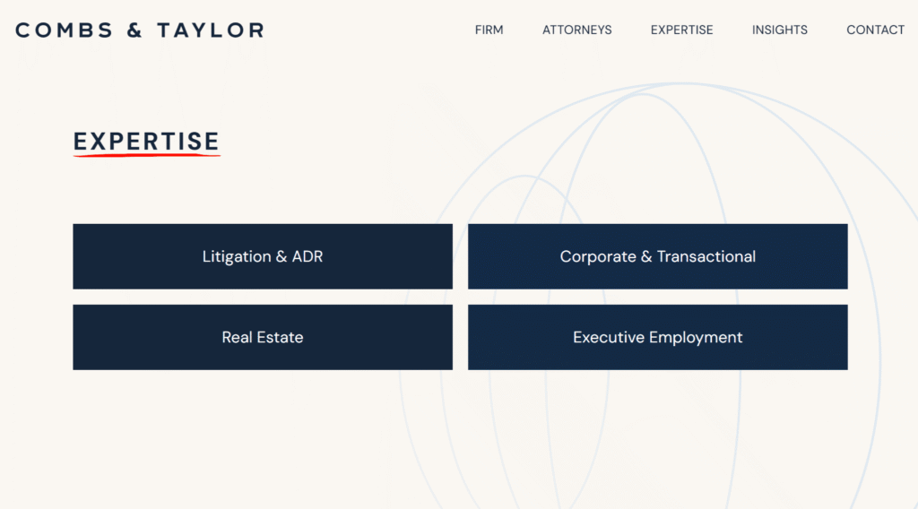
#45. Combs & Taylor
A modern and minimalist design uses clean spacing, simple typography, and restrained visuals to create a streamlined user experience.
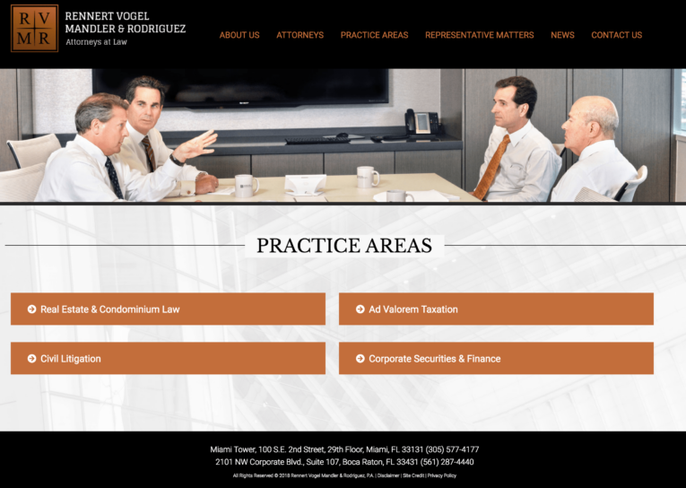
#46. Rennert Vogel Mandler & Rodriguez
A simple list presents practice areas in a straightforward, text-based format that prioritizes clarity and ease of scanning.
#47. BatesCarey
A simple list again uses a minimal structure to keep navigation direct and content highly accessible.

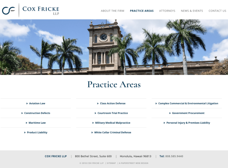
#48. Cox Fricke
A simple list continues the clean, linear presentation style that focuses on ease of reading and quick reference.
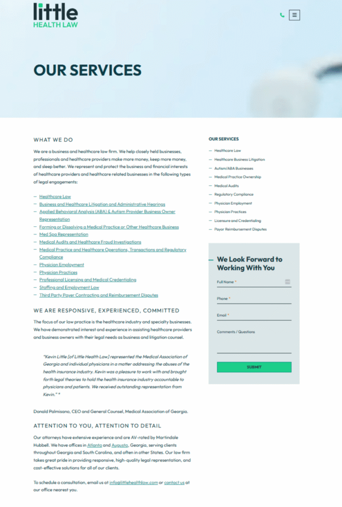
#49. Little Health Law
A narrative-forward layout uses descriptive copy and hyperlinks to guide users into deeper interior pages with contextual storytelling.
#50. SCG Legal
A simple list maintains a pared-back structure that ensures fast scanning and uncomplicated navigation.
We created them and can help you too.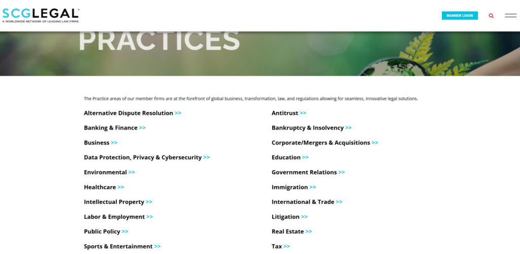
Want a practice page like these?
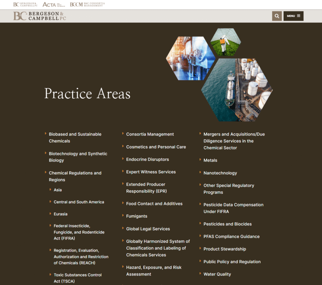
#51. Bergeson & Campbell
A branding-forward design carries visual elements from the homepage into a structured list format to create consistency across navigation.
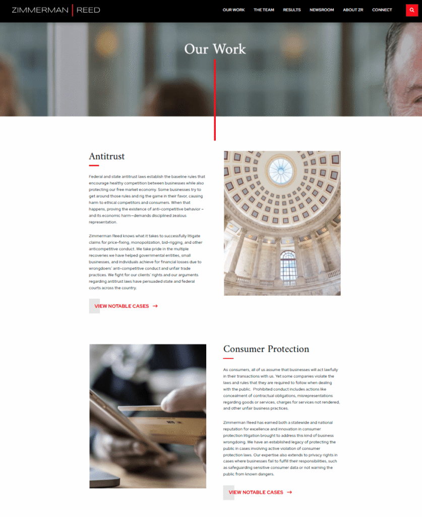
#52. Zimmerman & Reed
A narrative-driven layout pairs detailed descriptions and featured images for each practice area to create a more immersive browsing experience.
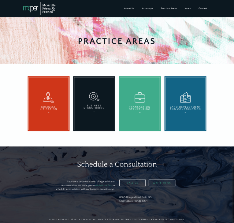
#53. McArdle, Pérez & Franco
Simple lists with colorful boxes introduce subtle visual variation to distinguish sections while preserving a clean structure.
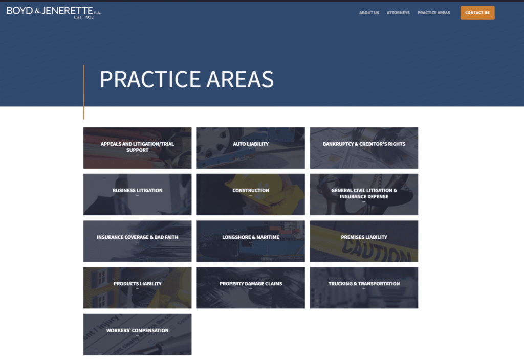
#54. Boyd & Jenerette
Simple boxes maintain a consistent, modular layout that keeps practice areas organized and easy to navigate.
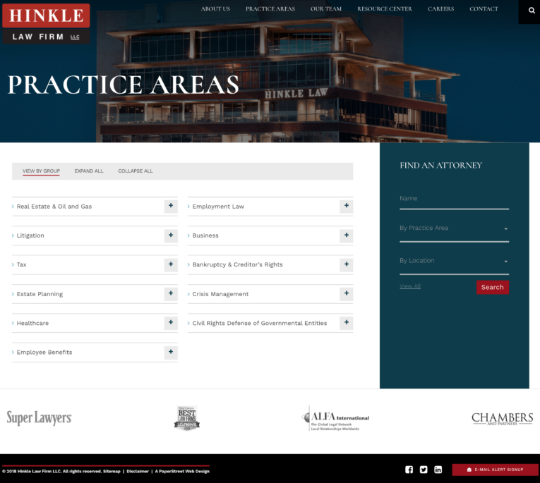
#55. Hinkle Law Firm
What you should do next . . .
Get a Free Consultation

Don’t stay too comfortable for too long - surround yourself with the opportunity to grow and learn.
Join our newsletter, where you will learn educational info on latest insights, tips and best practices.
Share:
About Us
Did you know more than 200 clients have worked with PaperStreet for more than 10 years?
Get a Free Website
Analysis and Consultation
Marketing Services