Updated 04/15/2026
Web Design
1. Too Much Clutter.
Junking up the site with too many graphics, content blocks and ads will prevent your users from absorbing any meaningful information.

2. Poor Images.
Photography can make or break a site, so choose your images wisely and try to allocate a good budget towards taking new bio photos.

3. Dated Logo.
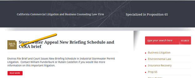
If you get a new website design or update your current one to look more modern and your logo still looks dated, the user will notice this disconnect, and it will appear inauthentic.
![]()
4. Overwhelming Content.
We know content is king; however, too much content that is not formatted or displayed well will overwhelm the user into not reading any of it and ultimately bouncing off the site.

5. Too Many Fonts.
Keep it simple with a limited number of fonts. More than three typefaces will create an inconsistent and scattered look.

Web Development
1. Not Commenting Code.
A minor nitpick, but not commenting code makes maintaining a site harder. Comment every code block.

2. Testing.
Not testing for desktop, mobile, and tablet is a bad practice.

3. Improper Indentation.
Poor spacing and indentation can make code harder to understand, modify, and maintain.

4. Forgoing Page Speed.
Using too many fonts, not optimizing images, or using too many libraries/plugins can have a significant impact on your website and your visitors.

5. Repeating Code Sections.
In development, we always suggest keeping it DRY (meaning “Don’t Repeat Yourself”). This means that if a specific functionality or code block on the website occurs several times, keep that code in one place and call it from one place. Doing so improves consistency, and your future self updating that code will be thankful.

6. Not Coding with ADA in Mind.
The law now requires all websites to be ADA compliant, which now makes this a requirement for building future websites. ADA non-compliance cases have nearly tripled in the last three years, making this a major thing to consider during development.
7. Choosing the Cheaper Hosting Alternative.
Going for the cheapest hosting option can lead to problems down the line, such as slower loading, downtimes, possible security issues and manual updating.

8. Using Absolute URLs.
Using relative URLs instead of absolute ones can save a lot of time and frustration if a website is ever transferred or a domain is changed.
9. Writing All Your Code Manually.
There are many editors, extensions and snippets that can be used to speed up your coding significantly.
10. Avoid Anything that Screams “Generic, Outdated, or Manipulative”
What hurts law firm marketing today is mostly credibility damage. Ensure your blog posts are up to date, don’t use stock images where you’re talking about the firm or important firm initiatives. Don’t call yourself diverse and then only show the same person on every page.
Pay-Per-Click-Advertising
1. Continually Hitting Budget Threshold.
Not having the proper budget for your ads to run for any given month continuously is never a good thing.
2. Casting Too Wide of a Net .
Focus on what’s important, be it location, schedule or campaigns. Having too much of anything can be harmful in some cases.
3. Low Quality Score.
All ads lead back to your website. Your site needs quality content that keeps the user engaged and results in conversions.
4. Google Content Network Advertising by Default.
5. Landing Pages Not Optimized for Conversions.
Lack of content
No contact form on site
No phone number at top of page

6. Not Testing Ad Copy.

7. Not Properly Tracking Conversions.
![]()
8. Not Using Negative Keywords in Your Campaign and Conversely, Using Keywords That Are Too Broad in Your Campaign.

SEO
1. No Foundation.
Not properly selecting keywords that match up to user intent.

2. No Optimization.
Using title tags with “Home” or a lack of focus. Also, having a page of content that is not supported by each keyword you are targeting is problematic.

3. Not Focusing on the User.
80% of your content should focus on the user; 20% of your content should focus on your firm.

4. Not Enough Relevant Content.
Law hubs and long-form content win. It is quality within quantity.

5. Not Formatted for the Web.
Write in digestible bite-size pieces and write naturally. No legalese.

6. No Cross Promotion.
Your blog should support your core practice area content. Link to it!

7. No Visual Aids.
Users like images. Add them to your content.
8. No Rhythm to Blogging.
Keep the beat and write regularly. It prompts Google to reindex your website.
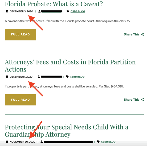
9. No Categorization in Your Blog.
Simply nest your blog posts in the correct folder. This helps users and Google alike.
10. Too Many Low-quality Links.
It is more important to focus on obtaining individual links of good quality instead of just quantity alone.
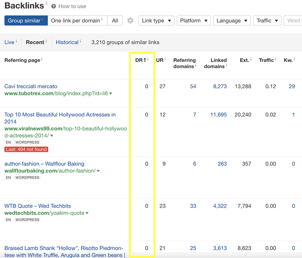
11. Too Many Links to Your Homepage.
Diversify your backlinks overall and make sure to point many of them to your subpages. Good quality content should have links to support it.

12. Not Monitoring Your Return.
Too much focus is spent on just rankings and traffic. Measure the value of your traffic and new-found exposure for qualified leads.

13. Keyword Stuffing.
Write naturally and use keywords in a contextual manner. Do not simply force them into the content and repeat them over and over.

14. Ignoring Keywords.
The flip side to the above is that if you avoid an appropriate keyword density, the chances of your page ranking are slim.

15. Slow-loading Website.
Your website takes too long to load and will frustrate visitors causing them to abandon the webpage. This can especially happen on slower mobile connections.

16. Focus on Quantity Over Quality.
When it comes to anything related to SEO, including backlink campaigns and content marketing, it is always best to have a quality over quantity approach.

17. Forgetting Your Target Audience.
A critical goal of your website is to attract clients. With that in mind, keep your reading level to an easy read and address the content that helps your client understand how you will help them.

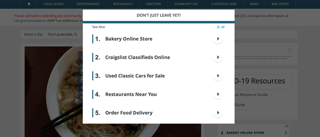
18. Too Many Pop-ups.
This can be very distracting to users and create a poor website experience (especially on mobile). Pop-ups are best to be avoided unless absolutely necessary.
19. No Anaylitics or Conversion Tracking.
It is near impossible to measure marketing success if there is no tracking in place. Make sure you have Google Analytics and conversion tracking setup on your website so you can check the progression of your marketing.

20. Cheap Web Hosting.
Going this route can result in poor page load performance, more frequent downtime from server issues and sites that are more vulnerable to security attacks.

Logos
1. Over-complication.
If every element in the logo is bright or distracting, it leaves the viewer confused and nothing memorable will stand out. Keeping it subtle, clean, and quickly recognizable is the way to go.
2. Illegible Fonts.
Typography is crucial to logo design and carries through all future marketing materials. Cursive fonts in most logos prove hard to read in some cases.
3. Isn’t Visible at Small Sizes.
A logo should be versatile enough to be scaled to smaller sizes and still be legible. This typically happens with fine details and thin fonts.
4. Too Many Colors.
Don’t overdo it with too many colors in a single logo. It can become busy and distracting.
5. Too Many Fonts.
When multiple fonts are used in a logo, they all fight for attention and tend to clash with each other, ultimately leading to a chaotic looking logo.
6. Isn’t Unique Enough.
Creating a unique logo helps your audience identify you right away; however, when a logo uses cliches or common elements, it doesn’t stand out from the crowd.
Social
1. Stale Social
It is better to not be on social than have an account that is two years out of date.
2. No Engagement
Just using social media as a soapbox. It is not. It is built for interaction and engagement.
3. Not Networking
They are called social media networks. If you are not connecting and networking, you are not using social to its potential.
4. Only Promotional Posts
It’s a social network. Join the conversation. Don’t just promote your services.
Newsletters
1. DON’T YELL AT YOUR AUDIENCE.
Email subjects should never be in all caps. Not only is it a red flag to spam filters, but you don’t want to YELL at subscribers.

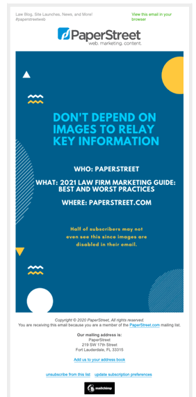
2. Don’t Depend on Images to Relay Key Information.
Most people disable images for their email. Make sure important information is reflected in the content.
3. Don’t Depend on Images to Make Your Email Look Good.
Again, some subscribers may not even see them, so ensure your newsletter works without and always use alt-text to describe images so everything still makes sense.
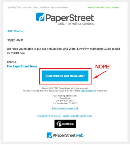
4. Don’t Include “Subscribe” in Your Newsletter
Don’t include a “Subscribe to Newsletter” CTA in your campaigns. Because, ya know, they already DID subscribe.
Content
1. First Person.
No one wants to hear “I, I, I” and “me, me,me”.

2. Spelling Errors.
Grammar and spelling errors are endearing, right?
3. Avoid Long Blocks of Content.
Long blocks of content are a SEO no no and very difficult to read. Break up your content with H2s and bullet points.
4. Avoid Inconsistency With Imagery and Colors.
Make sure the visual feel and style of the website remains consistent.
5. Avoid Passive Voice.
Speak like you would in normal conversation. Both Google and your potential clients prefer normal speech over the writing used in a college essay.
6. Short Copy.
Avoid only using a few sentences on a page. It’s best not to leave the facts up to the imagination.
7. Five-Dollar Words.
Avoid using those big words from college and law school as much as possible.
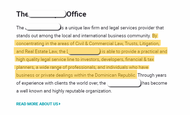
8. Generic Cookie-Cutter Content.
Make sure your content is unique to your business and showcases why you are an expert in the industry. Be sure to prove why you stand out from the competition and bring valuable insight that isn’t found on the web already. If you aren’t adding something new or better to the conversation, Google isn’t going to value your content over someone else’s.
9. Forgetting Your Blog Exists.
You should be posting on a regular basis – weekly or monthly.
10. Text-Only Pages.
In 2023, no one wants to see a huge block of text without images, video, or quotes to add to the story.

11. Long Sentences.
It’s the internet and we all have short attention spans. Write like a human with simple sentences.
PaperStreet Helps Firms Avoid Becoming a Website Tragedy
We know the tricks of the trade and the things to avoid when marketing your firm. Find out more!