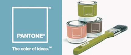
When to Use CMYK colors v. Pantone colors.
Quick Overview
CMYK colors are ideal for full color images, such as photographs.
Pantone colors on the other hand should be used for stationery and logo designs.
The Reason
The reason a Pantone color should be used is to ensure your branding color is consistent throughout.
Quick Example
A specific example of cost savings is a batch-printing job using CMYK over Pantone. A Pantone color process is more expensive due to the labor involved with printing – ink mixing, loading the press, printing the job and then cleaning the press.
Long Technical Explanation
CMYK (Process) – When printing an image in CMYK, the file is separated into four primary colors: cyan, magenta, yellow, and black.CMYK colors are simulated colors and are not pre-mixed. When an image is recreated there are screen tints made up of small dots that are applied at different angles to the four process colors. The separated colors are than transferred to four different printing plates on the press. The colors are than printed multiple times one after the other to create the final image.

PMS (Pantone Matching System) – On the other hand, PMS colors (also known as Spot or Pantone colors) are particular colors that will accurately reproduce in print. Instead of trying to simulate colors, PMS colors are pre-mixed published color formulas with an existing palette of 14 basic colors. There are however, Pantone swatch books that feature an array of colors aside from the 14 basic color palette. This gives your printed piece the cleanest and truest color result.

Need Further Assistance?
At PaperStreet, we specialize in creating custom web designs that help law firms stand out and grow their practice. With our proven strategies and industry expertise, we ensure your website not only looks great but also drives real results. Ready to elevate your firm’s online presence?
Contact us today for a free consultation and discover how we can help you attract more clients and cases.
What you should do next . . .
Join our newsletter, where you will learn educational info on latest insights, tips and best practices.
Share:
About Us
Did you know more than 200 clients have worked with PaperStreet for more than 10 years?
Get a Free Website
Analysis and Consultation
Marketing Services


