Before and After: Law Firm Website Redesigns

launch banner

The desire for a new website design stems from a wide array of possible scenarios. Perhaps a law firm has added a partner or new practice area. Maybe the firm is expanding its geographic reach. A strong reason for a new website design is to create a “responsive” design – meaning the site will stay visually pleasing across all platforms. In most cases their site is really outdated and in need of the unique PaperStreet touch. 

In order to help our new and existing clients review the impact of a new design, we created a few side-by-side representations of the redesigns we have done recently, so you can see firsthand the improvements and the upgrades we make — of not only style and appearance, but responsiveness and usability.
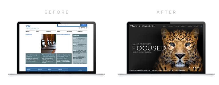
https://www.elliswinters.com/

Two laptops display a website's "before and after" redesigns. The left screen shows an older, text-heavy layout, while the right screen features a sleek design with a large image of a leopard and focused layout. This showcases the transformation in law firm website redesigns.

https://hendlerlaw.com/

Two laptop screens side by side showcase a law firm website redesign for Hendler Flores Law. The "Before" site has a green nature-themed banner, while the "After" site features a close-up image of a person. This transformation epitomizes Before and After: Law Firm Website Redesigns.

https://www.kwgd.com/

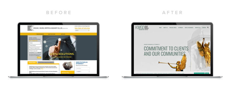
Before and After: Law Firm Website Redesigns – A side-by-side comparison of a website before redesign (left), showcasing a cluttered, yellow and gray layout, and after redesign (right) with a cleaner, minimalist design featuring imagery of a statue.

https://www.maleklawfirm.com/

Two laptops side by side. The left screen shows a website labeled "Before" with a plain design. The right screen displays the modern transformation labeled "After" with a tagline "Family from helping families." A perfect example of Before and After: Law Firm Website Redesigns.

https://www.mclaughlinstern.com/
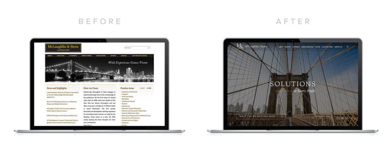
Two laptops displaying the same website: on the left, the older version with a dense text layout; on the right, the updated version with a modern, minimalist design focusing on a bridge image and the word "SOLUTIONS." This before and after highlights law firm website redesigns at their best.

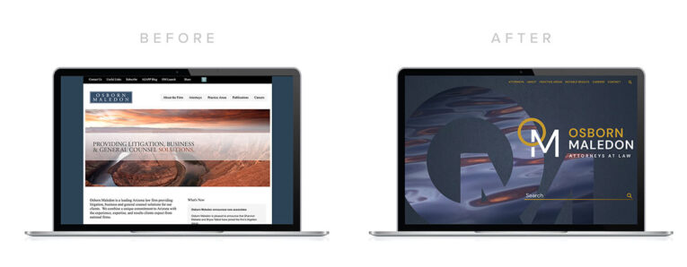
https://www.omlaw.com/

Before and After: Law Firm Website Redesigns – A side-by-side comparison of Osborn Maledon's website transformation, where the "Before" version features a white background and text-heavy layout, and the "After" version showcases a dark, modern design.

https://popelaw.net/

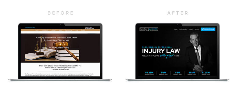
Two laptop screens side by side. The left displays a "before" webpage with a book and gavel image, while the right showcases the transformation in an "after" website featuring a professional photo of a man and injury law information. Before and After: Law Firm Website Redesigns perfectly illustrates the improved presentation.

https://slpattorney.com/

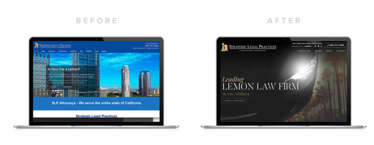
Before and After: Law Firm Website Redesigns - The left screen showcases the old design featuring a blue theme with buildings, while the right screen unveils the new, modern design with a sleek black theme and focused branding.
Share This
Blog Decorative Background

Join the Sales and Marketing News, receive our last insights, tips and best practices.

Our 7 Guarantees

Keeping 2,000+ Clients Happy Since 2001.

1
You Will Love Your Design We design to please you and your clients
2
Same-Day Support 24-hour turnaround edits during business hours
3
Free Education We provide knowledge to help you expand
4
No Hidden Charges We quote flat-rate projects
5
Own Your Site No strings attached
6
We Create Results SEO, PPC, content + design = clients
7
We Make Life Easier One agency for web, branding and marketing