Avoid Website Design Pitfalls with Tips from the Team at PaperStreet

In business since 2001, the PaperStreet web design and internet marketing teams have seen a LOT of websites. We pride ourselves on creating innovative and award-winning designs that also convert site visitors into customers. Many businesses and law firms come to us with great-looking sites that simply need updating. Others come to PaperStreet in need of a complete web makeover due to outdated styling or poorly functioning features.
With that in mind, we like to help our clients understand how to design a great website. Whether you choose us to help you build your dream website, or you plan to tinker with the site yourself, we’ve created this post to help you avoid some common web design pitfalls.
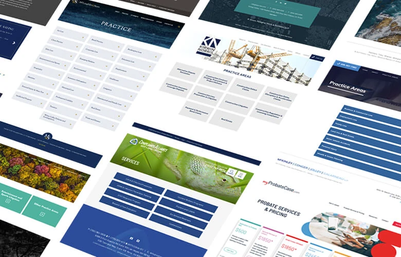
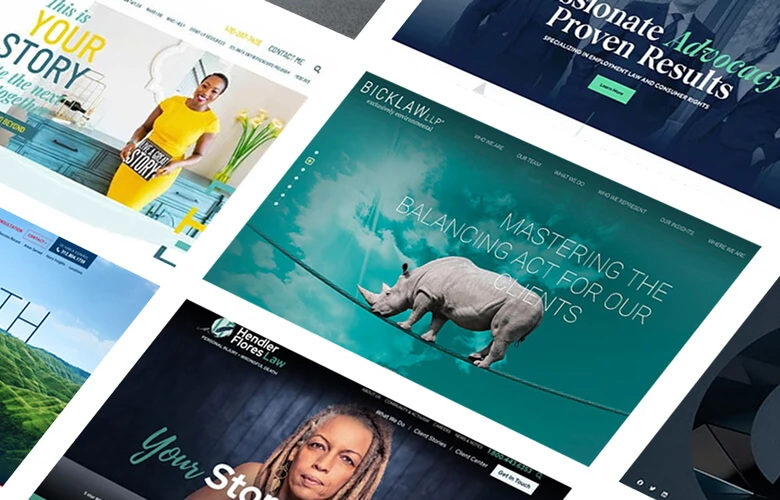
Be Sure to Use Optimized Images
A visually appealing site is often a primary goal of businesses and law firms. Sometimes, however, the desire to include images and a unique appearance can lead to poorly crafted visual elements. Here are some of the imagery “don’ts” our team hopes you avoid:
Amanda, Design Manager:
Bad cutouts of images — such as when there’s a line around an attorney, where the image wasn’t properly cut out from the background, etc. Cutouts can look realistic if they’re done right, but unprofessional if they’re done wrong.
Pixelated images — Images should be kept up to date and in the right resolution. If your images are pixelated, it might be time to think about scheduling a new photoshoot.
Mike, Senior Web Developer:
Websites that push too hard for style over usability. Designs on the bleeding edge often make sacrifices in performance or even basic readability. Your business or law firm’s website often exists to solve client problems. This can happen most efficiently through content that isn’t hampered by an overly ambitious design.
David, Technical SEO Manager:
Incorrect image sizing — such as when there is an image being used on a website that hasn’t been scaled down using best practices. In some instances, a high resolution photo will be used on a website, but it was scaled down using CSS code instead of the actual image itself being reduced in size. This results in the website needing to load an image that is probably over 1MB (which is huge) when it could have been a reduced file size that helps the website load faster overall.
Gui, Essentials and Support Manager
Altering an image to the point it becomes distorted. For example, a vertical image can’t be placed in a horizontal area without becoming stretched and visually unappealing. Low resolution images are also a poor choice as Photoshop can’t do much to improve that.
Pay Attention to Your Text Formatting
Though the aesthetic of your website is important, many business owners and attorneys overlook the importance of how your text is presented. Your text is what answers client questions, displays your expertise and helps clients identify why they should select your company or law firm. With that is mind, here are some design styles to avoid with the content of your site:
Elyssa, Creative Director
A big design no-no is too little padding. Not enough white space between lines of text, objects, graphics and sections of content gives the appearance of clutter and can overwhelm site visitors.
Additionally, avoid paragraph content that is a very wide column that goes across the full width of the page. This is too hard to read as your eye has to scan the entire screen.
Nancy, SEO Content Manager:
The use of unconventional fonts. Creativity is definitely a key goal for your web design, but that shouldn’t impact the text of your web copy. You want potential clients to read how you can help — not get distracted by unusual or unappealing fonts.
Andrew, Jr. Developer
Though a large pop-up could be beneficial to advertise a sale or promotion; as a rule, large, full-screen pop-ups should be avoided. This design feature is definitely disruptive. It’s typically a better site experience for the visitor to scroll content organically rather than being bombarded with forced content.
Most Importantly, Make Sure Your Web Design Makes It Easy for Clients to Contact You
This post was created simply by asking our team members the most important tips for web design. The number one response, by far, was to pay careful attention to the accessibility of your contact form. Many team members stressed the importance of how your contact form is presented and below are the quotes that best summarized the collective feedback:
Alex, Vice President & Internet Marketing Director
Conversion metrics are not only great for marketing and users, but they’re important for functionality. Don’t make it difficult for potential customers to contact you. Not all site visitors prefer the same method of communication. Instead, offer a combination of contact forms, chats and/or click-to-call links.
Drew, PPC Manager
Place your contact methods above the fold. From a marketing and conversion standpoint, potential clients are not going to go digging through the site to find ways to contact. A clickable phone number and form or contact button should feature prominently near the top of every page. This is especially true on mobile.
A Final Takeaway
Even the best web designs need a refresh every few years. An overhaul isn’t always necessary, but some elements need to stay looking up to date. Be sure to evaluate several factors when determining if your design is appealing enough — and functional enough — to benefit your business or law firm.
Stephanie, Graphic Designer:
Remove anything that makes your website look out of date — such as blog posts from 5+ years ago, a lack of a mobile friendly or responsive design, broken image links, etc. Any of these can lead users to think you’re out of business. It could also lead a potential client to be concerned about the quality of service you are providing and ultimately give your competitors the upperhand.
What you should do next . . .

Letting a problem fester is never the answer. Always dive right in and be ready to try several solutions. Persistence yields success in the marketing world.
Join our newsletter, where you will learn educational info on latest insights, tips and best practices.
Share:
About Us
Did you know more than 200 clients have worked with PaperStreet for more than 10 years?
Get a Free Website
Analysis and Consultation
Marketing Services