Webinar: Social Media Artwork
You don’t need us to tell you that social media is important. By standing out on major social networks you can attract new clients and increase brand loyalty and awareness – it’s an opportunity you should take advantage of.
My latest webinar touches on the latest approaches to social media artwork, specifically Twitter. When designing for Twitter use the following dimensions:
- Profile photo: 500 x 500 pixels
- Header: 2560 x 600 pixels
Check out some of the main slides below or download the full presentation, also included are the dimensions for other main social media accounts: Facebook, YouTube, Google+ and LinkedIn.
Law firm examples are not necessarily PaperStreet clients.
Webinar Transcription
That you can enter on your Twitter profile page and, again, it goes right on top of the photos, so another reason why you don’t want any text on your photo. I’ll show you an example later of somebody that does this and it kind of works well, but for the most part, a nice photo works. So, again, these are the latest Twitter updates, which is no more background photo and a header for … Let’s look at some more examples.
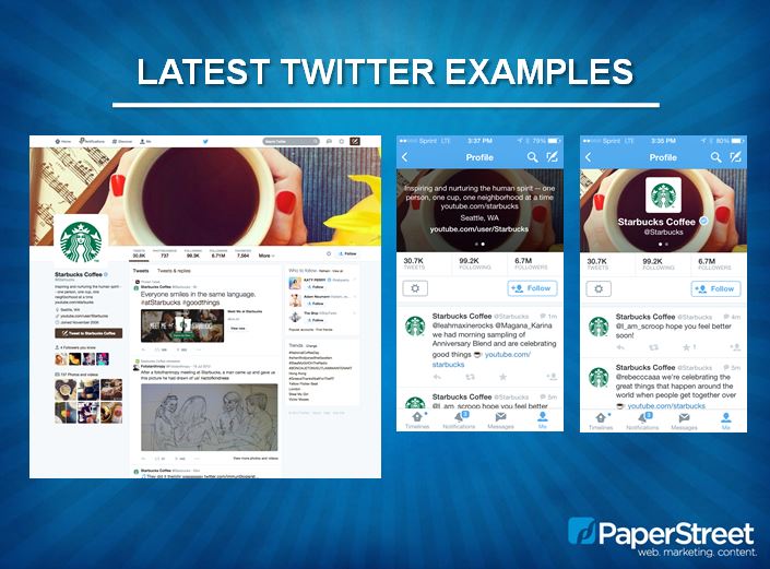
Starbucks is another good one. I particularly like their choice of photo, and here they’re being creative with a different angle, which as you can see as you go over to the logo here, their profile icon logo and their name is situated perfectly over the coffee cup. It’s very creative, so again, just having a photo might be simple and boring, but you can really pick the right photo that really works well. They have more text as you, again, slide over with your finger on mobile with those two little radio buttons, you can see that this is the text they chose to put in for their Twitter, Twitter about us profile and it obviously limits your character numbers. And so that it’s just the appropriate amount of text on there, but it blacks out the photo a little bit, so you can always make sure you can read that text there.
Another good example is Tesla. I mean, this is just an example of a photo. It speaks for itself. Obviously they don’t really need to say much. Their cars are very striking and attractive, but, again, it’s just about having it work on mobile, too. So when you go over to the mobile, it’s just a nice picture with the logo and then they have more text on top of their secondary slider shot on mobile.
The App Store for Apple which I’m sure most of us are familiar with, they just chose to have a pattern. So this is a unique approach because this really gets the user to focus too on the actual tweet. So if you have a lot of graphics and photos with your tweets, those might really need to be what’s important and what stands out more. So just having a nice pattern in the background there on the cover photo is a good option as well, and as you can see, it looks great on mobile. Ultra-simple for mobile, and for them they just put their location and their URL for their website. Very, very simple.
Cadillac has a little bit of a different approach, which they did choose to have some text on their cover photo. And this is one example I wanted to show you; however, they put it in the top right corner, so all the way as far as you can go on the right corner there so that when it goes to mobile, you don’t even see that. It doesn’t jeopardize the photo or the profile logo on top, and then, again, when you use your finger to swipe to the side, it doesn’t jeopardize any of the copy that is on there. So this is a good example that if you have to have a little bit of text there, that’s probably where to put it for now.
CVS recently just has come in the forefront in my mind because they just chose to stop selling all tobacco from their store, bold news. So I guess I wanted to see what they were doing. Again, this is kind of like the App Store. They just chose to have a pattern. They don’t really feel like one photo could probably sum up their brand and therefore they just chose to really make it all about their tweets and just have a nice background pattern in color. So this works well also.
So that’s what to do. There’s just a couple examples of what to avoid, and I did choose some law firms for these examples because, again, I want to focus on what our industry is mainly about. So Morgan Lewis, they’re a really big firm and I wanted to see what some big firms were doing. So this looks like something they probably want to update because it looks great on the desktop view to have the text there, and even though they did try to put it on the right hand side, you can see what happens when it gets to mobile.
Now you have the ML logo profile image on top of the photo and the name and it’s getting a little bit hard to read. You especially can’t read the text on the photo anymore. So it’s just really not working and sort of makes it look like they didn’t think that through. Same with when you slide to the side, you can see that the information text is also on top of the photo now, which basically means you have text on top of text. It just doesn’t really make sense to do that. So if they just had the photo without any text on it, it would work really well.
Same with Holland & Knight. I think the collage is great. Again, I mentioned that earlier. You can do a collage if you can’t just pick one photo; however, it’s not necessary to have their logo on top of the photo or, I’m sorry, the firm name typed out because when you get to mobile you have the H and the K on top of the Holland and Knight and it just becomes a little busy and doesn’t work. And same with it’s hard to read on that information text as well.
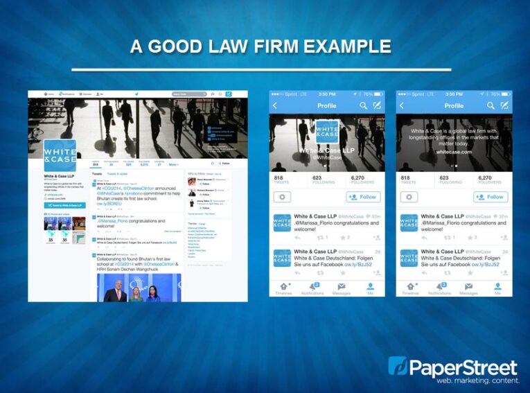
White & Case do a good job. This is a good law firm example. Their information on the very far right is some of their social media as well as they choose to mention attorney advertising doesn’t guarantee results based on a prior outcome; however, I think that this is a little bit hard to read even on a desktop, so it might be a little bit bigger. I think it still should be a little bigger without showing on mobile. In any case, this is a really good example.
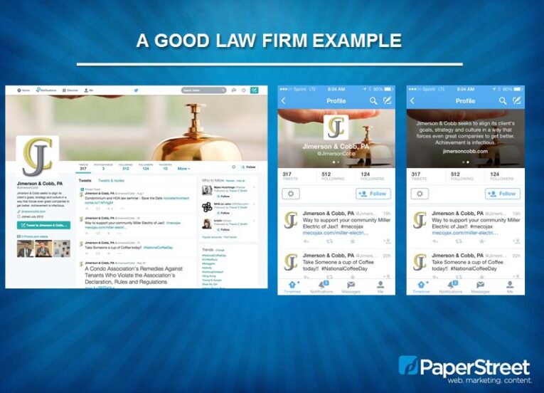
This is also a really good example because the photo is just so inviting. It’s on their website and, again, they just chose to put a photo up there. They were able to select the best photo that represented them, which is all about their service and their dedication to their clients and personal attention. It’s just really bright and it works well on the mobile, no text on the photo so it doesn’t cover anything up. And then that concludes sort of some Twitter examples, and just as a reminder there are some sizes on here for all of the other social media, so this is really what we should be working with now and we can help anybody with that or if you want to do it on your own, these are the sizes that you can reference for Big Book, LinkedIn, Google Plus and YouTube.
YouTube is a huge background graphic, again, and it’s a little tricky because if you’re on a huge TV monitor, you might see more of the graphic that you choose to upload; however, when you’re on a smaller device it’s really going to cross that area. So you have to be selective again and play around with how that photo crops down when you resize your browser or view it on smaller devices. So sometimes it’s trial and error, just seeing what works best, but test it out on a lot of different devices to see what’s actually happening.
These are just some key notes that if you are going to have the words, don’t be too wordy like I said, but the trend is to not really use copy anymore. Be consistent with your website. So choose a photo from your website so that you can carry over that brand continuity and just consider that there are so many devices out there and how does your photo look on every single device. And then here’s just a little reminder of what the consequences are when you’re ignoring social media. Users everywhere are important. I mean, more and more people, it’s becoming a standard to use social media. It’s basically thinking about are you ignoring your audience? Who really is your audience and if any part of it uses social media
Then it is worth it to explore creating accounts and we can help with that. We know the best practices and we can also help with creating the artwork. That concludes our webinar. If you have any questions, please email myself jillian@paperstreet.com or jen@paperstreet.com for any pricing information and I can answer any creative questions for you. Thank you so much for attending and we hope to hear from you if you have any questions.
Transcription provided by Speechpad.


