Tuning Your Website for Modern Page Speed Metrics

You’ve heard it before, but prepare to hear it again: Speed on the web matters more than ever before. Users are more impatient than ever, websites are browsed on bandwidth-sensitive mobile devices more than ever, and Google’s SEO ranking algorithms factor in the user’s experience of performance more than ever, too.
There’s a need for speed, and as website producers and owners, we need to stay ahead of this trend.
In this article we’ll review the latest in measuring website performance. There are new metrics to learn about and fresh techniques for achieving ever-faster page loads. We’ll start by covering general performance concepts before delving into practical code samples that you can use to enhance your website’s loading times today.
Speed is Client-Side
First, let’s consider where speed on the web really comes from. It’s not Google, it’s not underpants gnomes, and believe it or not, it’s not all about your hosting provider, either.
Web pages are files hosted on a server somewhere on planet Earth. Those files make their way to your computer by light speed. The server in a distant land matters in this process, but not as much as you might think. In reality, web performance is more based around the very computer or mobile screen you are using this moment than it does on that faraway machine.
In a 2012 blog post, Steve Souders, a web performance expert, went as far as to say web performance is 80% front-end, or client-side, and just 20% server-side. That means all the HTML and JavaScript and the order in which it all happens on your computer matters at a 4-to-1 ratio more than anything else.

Performance is client-side and where most optimization work should take place.
Methods for Measuring Speed
There are a host of tools to gauge web performance, and they all present information in similar but uniquely useful ways.
Three excellent tools we can recommend for speed testing, and very much in order of favoritism, are:
- The Chrome DevTools’ “Network” tab
- WebPageTest
- PageSpeed Insights
DevTools
Let’s start with the Chrome DevTools. The DevTools aren’t a traditional page speed test in that it does not report back on speed results in any subjective way, nor does it give suggestions for improvements. It’s an objective data feed located in an easy-to-access place. To a trained eye and in a couple minutes or less, The DevTools make it possible to see how much is loading on a page, assess the order in which files load, and maybe even identify some bottlenecks.
To access the Chrome DevTools, you’ll need Chrome open as your web browser. Simply press Ctrl (or Cmd) + Shift + C, then look for the “Network” tab at the top of the DevTools window. Refresh the page you are on with F5 to give it a fresh reload of data.

You will see file size information at the bottom of the tools, along with a waterfall chart to show when every file comes in and how long each asset takes to load. It is a truckload of useful information and just a key combo away. For these reasons, the DevTools are an indispensable tool in our quest for speed.
Page Speed Tests
The rest of the tools we’ll review do a bit more. They pretty up the results, offer hard-and-fast steps to take to improve speed scores, and are a bit more subjective in what they show.
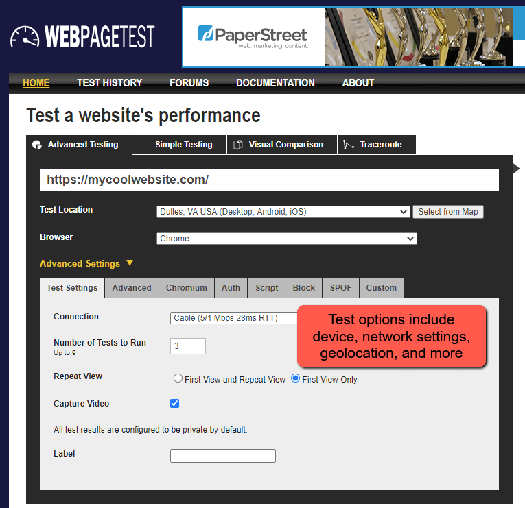
WebPageTest is like the Chrome DevTools, but it brings more data points and options for running tests. Features include the ability to select devices to hold the tests on, including geolocation. You can also run multiple tests in a row to ensure results are consistent, share results with a link, and utilize a handy waterfall chart.
The ability to run several back-to-back tests and aggregate their scores should not be understated. Even the best speed tests do not give very consistent scores. This makes sense, as transfer speeds across the internet are always in flux. But running several tests in a row and averaging them out smooths out some of that error.
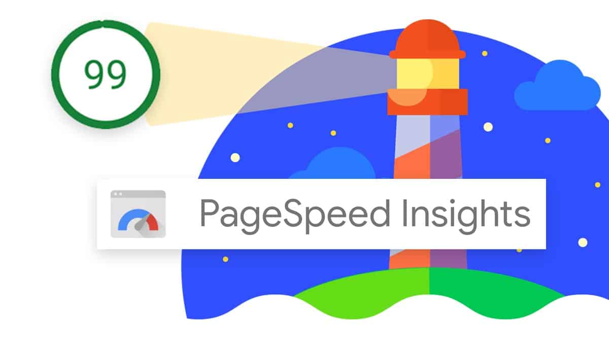
If WebPageTest is the technical and nerdy speed test, PageSpeed Insights is its refined, dressed up cousin.
PageSpeed Insights (PSI) is speed testing software made by Google, our Internet Overlords. It is powerful and popular for good reason. The tool presents information in an easy-to-digest manner, loads test results quickly, and matters a lot because, well, we want to keep the boss happy.
We’re serious about that, too: Google’s search algorithm cares about speed in a meaningful way, and if Google’s own speed test shows good results, you are on track for a better SEO ranking. This, in turn, can bring more visitors and better results from your website.
PageSpeed Insights’ results are now entirely based around a set of values known today as the “Web Vitals.” These new metrics, which we will soon detail, saw their introduction and widespread adoption by Google last year, although they did not gain the title “Web Vitals” until May 2020.

Besides that, PageSpeed Insights offers helpful, actionable suggestions for speed improvements tailored in a way to specifically improve on the Web Vitals. There are few better ways to get a grasp on Google’s speed metrics than to run tests on your favorite websites and review the suggestions PSI shares.
Many other speed tests are available online if you look for them. GTmetrix and Pingdom are two fine choices. They give fairly consistent and accurate results in appealing packages with some steps for improvements. But after getting through the DevTools, WebPageTest and PageSpeed Insights, one really must ask: Do I need more?
The answer is “nope.” Speed test results tend to be redundant.
With a few great tools at the ready, we can think about how to improve our initial speed scores.
Perceived Speed
Web performance is subjective and interpreted by human eyes. If you can give the perception that the page is loading faster than it is, you might as well be adding performance even where no improvements took place. Call it the act of a magician. Or a dastardly, psychologically-minded web developer.
A sub-second loading time on a website is possible if the page is well optimized and the user’s network is fast. Below one second, we barely notice a loading pause. But beyond that, a developer might consider tricks to alter the sense of time.
Techniques include:
- Loading feedback like progress bars or animated icons. Any kind of distraction reduces the feeling of passive waiting
- Bringing in top-of-page content immediately, even if content further down the page hasn’t yet arrived
- Predicting the user’s intentions. For example, beginning to preload related item images in an e-commerce store with the expectation that they might hover over one of those items next
On each optimization you make to your website, ask, “is there something I can do to make this seem faster?”
Introducing The Web Vitals
Traditional web page performance metrics include dry but crucial data points like the total file size (page weight), number of requests, and DNS lookup time. While these are useful bits of information, they do not paint a complete picture of how a page really loads on a user’s device.

The Web Vitals can be thought of as derivatives of older performance metrics meant to give us better insight into the user’s real loading experience. There are six of them:
- First Contentful Paint
- Time to Interactive
- Speed Index
- Total Blocking Time
- Largest Contentful Paint
- Cumulative Layout Shift (not a time measurement)
Note that five of these six values are measurements of time, reported in either milliseconds or seconds. They’re meant to occur fast, typically within two seconds or less. The general order in which these markers are met, from first to last, is: First Contentful Paint, Time to Interactive, and Largest Contentful Paint.
Each metric’s individual scores are factored directly into Lighthouse’s performance calculations (see calculator).
Let’s break down each of these metrics before we get into the nitty-gritty of ways we can improve on them.
First Contentful Paint
First Contentful Paint, or FCP, may be the easiest “vital” to understand. FCP marks the first point during the page load when the browser has shown any content of significance. This should be distinguished from First Paint, a metric that marks the loading time when anything is rendered by the browser.
The idea of a “contentful” paint is one that first lets the user consume information on the page – namely, text. But as noted by a GTmetrix blog post, the First Paint and First Contentful Paint may be tracked so close in time they are one and the same.
It makes sense that a first paint occurs very early in the loading process, making it a good indicator of back-end performance. The server’s job is just out of the way at this point as the website files are delivered to the client (the user’s web browser and computer) to interpret. Being so related to server performance, FCP is a metric that can be greatly influenced by the quality of one’s web host.
Useful for: Detecting speed blocks happening before anything useful renders
Target FCP: 0-2 seconds
Time to Interactive
Time to Interactive (TTI) signals when the page is fully interactive. This means content is displayed (FCP has occurred), event handlers in JavaScript are ready to fire, and user interactions like scrolls, clicks, or taps can take place. In other words, the page is functional.
The perception of a loaded page can be betrayed if a page looks ready to use but the visitor cannot do anything with it. This causes frustration and degrades the user experience.
As a real user interaction gauge measured by algorithm, TTI is often an imperfect approximation of when the page is interactive. Do not think of TTI as a moment set in stone; in truth, all speed tests can have some degree of variance.
A focus on JavaScript loading and execution is the best path to an improved TTI score. Defer what JavaScript main thread work you can; load only the scripts you need when you need them.
Useful for: Determining how fast the user can use the page
Target TTI: 0 to 3.8 seconds
Speed Index
Speed Index marks a visually complete milestone in the load time. It is a tricky-to-compute value that actually measures visual progress using snapshots of the page load as it progresses. Once a certain interval of layout changes are finished, the Speed Index marker is met.
Like most metrics, Speed Index is imperfect. It doesn’t consider jitter (page jumpiness on load) nor the importance of different content in the load. Nonetheless, it is a sort of all-encompassing speed value that relies more on the visual aspect of the load than anything happening under the hood.
WebPageTest’s documentation provides a detailed breakdown of how it finds Speed Index.
Useful for: Providing an overall speed gauge; good as a before/after comparison point
Target Speed Index: 0-4.3 seconds
Total Blocking Time
Total Blocking Time (TBT) measures how much time during the load user input is actually blocked. While this sounds similar to Time to Interactive, it is calculated specifically on the blocking caused by “long tasks,” or slow-to-load assets.
Google’s own documentation indicates a 50 millisecond task is the key cutoff to determine a “long task.” Anything above 50ms load time on an asset like a JavaScript or font file adds to the blocking time.
All blocking time across all the assets loaded on the page equals Total Blocking Time.
According to NitroPack, TBT is valuable because it indicates what is happening between the First Contentful Paint and the Time to Interactive. It offers a look into how interactivity suffered during load rather than when interactivity was supposed to be possible.
It is useful to note that “Long tasks” are visually indicated in the DevTools Network Tab as gray shaded blocks.
Blocking time is expressed in very low values, as anything above just 0.3 seconds is considered less-than-stellar. This means just a single gigantic task or two can have a great impact on the metric.
Useful for: Finding individually large loading blockers
Target TBT: 0-300 milliseconds
Largest Contentful Paint
Largest Contentful Paint, or LCP, indicates the render time of the largest image or text block visible in the viewport. The size matters here, because while First Contentful Paint measures the first indication of “useful content,” LCP looks for the biggest render on the page. This makes the assumption that larger content or imagery equals more important.
LCP can also be thought of as the “Later” Contentful Paint. It captures more of the page load experience than its predecessor FCP.
The Timings section in Chrome’s DevTools identifies the Last Contentful Painted element.
Useful for: Tracking when the biggest part of the page finishes rendering
Target LCP: 0-2.5 seconds
Cumulative Layout Shift
Cumulative Layout Shift (CLS) measures the extent to which elements on the page move around during load. Like the other metrics, less is better – but in this case, we aren’t measuring time. Instead, CLS measures the total layout shift that occurs using some fancy math.
Any web user can attest that unexpected page movement can be infuriating in the wrong moment. It can lead to misplaced clicks, wrong buttons being pressed, ads being followed, forms being submitted, and so on. All of this is bad.
Layout shifts happen when page elements load asynchronously, bumping surrounding content up or down when they arrive. While asynchronous loading is usually thought to be good for performance, it can introduce problems. In short, the space that a late-loaded element might occupy needs to be reserved. Pre-setting image dimensions in the <img> tag is one way to accomplish this.
<img src="images/man_and_dog.jpg" alt="Man with his dog" width="400" height="400">
When animating, use of CSS transforms rather than width, height, or position values is not only better for graphics performance, but will also reduce layout shifts. A dual benefit!
.move-in-from-left {
	position: relative;
	transition: all 500ms ease-out;
}

.move-in-from-left.incorrect {
	/* This animates an actual position value and forces re-paints in the browser */
	left: 20px;
}

.move-in-from-left.correct {
	/* Instead, use a transform */
	transform: translateX(20px);
}
Google’s documentation on improving CLS is excellent: https://web.dev/optimize-cls/
Useful for: Seeing how much layout shift occurs during load
Target CLS: Less than 0.1
Size, Sequence, and Suggestions
Achieving better and better website performance is an iterative process and one that is never necessarily “done.” And while there are specific steps to take to improve upon particular metrics, top speed scores are achieved by adhering to general good practices.
The two overarching ideas behind a high performance website are Size and Sequence.
Size matters because if a website is simply a collection of files, we want those files to be as small as possible in terms of kilobytes (KB) for fast delivery.
Sequence matters because if we can manipulate the order in which assets load, we can prioritize them.
So we want efficiently-sized files delivered in an efficient order. Notice how all of the suggestions below tie back to these core ideas.
Hosting and File Delivery
Web performance begins with the server quality that actually delivers your website’s files. A good server and well-written backend code are key for a fast Time to First Byte (TTFB). This directly translates into a better First Contentful Paint (FCP).
Start by investing in a strong hosting provider. If, like many of PaperStreet’s websites, you are using WordPress®, find a premium WordPress®-oriented host. We like WP Engine.
If you are on Drupal, find a good Drupal host. The point is, if you really, truly, care about your website, spend a little. Call it a business expense, then pat yourself on the back.
Discount web hosts are a dime a dozen, and their inexpensive services usually bring subpar results. Not only could your site be less reliable and wholly insecure, but its speed will be spotty, left to the whims of the shared server your website sits on.
Once you have a host, strongly consider a Content Delivery Network. A CDN, as defined by WP Rocket’s guide to CDNs, is a globally distributed network of servers between your website’s origin server (in this case, the host we just paid up for) and your visitor’s location.
Basically, it’s an intermediary file delivery location.
If your web host is based in Dallas but your visitor is browsing from Berlin, a CDN can deliver your website from a location in Europe. This, in turn, greatly improves the speed in which assets are received. Yep, even light speed travel has distance to cover.

Cloudflare is a commonly-used CDN option, but some hosting providers including WP Engine offer CDN services directly through their hosting platforms.
Takeaway: Pay up for a quality web host, and consider a CDN.
Enable Caching
Caching is an ubiquitous web technology that allows a server to store a static version of a web page for faster, repeated delivery in the future. Once a server has the website cached, it can continue delivering that saved version of the site, reducing Time to First Byte on every load.
There are actually two caches – one on the client (user’s browser) side, and one on the server side.
Leveraging Browser Caching
To “leverage browser caching,” as Google often recommends in its speed suggestions, means to ask the client’s computer to save some website files so the files don’t have to be re-downloaded on each visit.
On Apache servers, browser caching can be requested by pasting a standard block of code into the .htaccess file, uploaded by FTP. Each filetype is given an expiration time. The shorter the expiration time, the more frequently the filetype will be downloaded fresh.
See GTmetrix’s article “PageSpeed: Leverage browser caching” for the code and explanation.
Enable Server-Side Caching
Server-side caching is set up in your hosting provider. Typically, they’ll have it enabled by default, with some kind of option to clear the cache on demand.
If your server does not provide caching by default, WordPress® plugins like WP Super Cache can provide another way to implement it.
Takeaway: Caching is crucial for performance, so enable it however you can.
Asset Compression
Now that we’ve covered the medium for transferring files, let’s consider the files themselves. In general, we want our website’s pages to be delivered as the smallest file size payload possible. So trim the fat, and do so aggressively. This reduces bandwidth consumption for visitors and servers and means we need less files to travel across the internet before the page load is complete.
But remember, there are no free lunches. File compression comes at the cost of quality, and over-compressed images can indeed turn into horrifyingly pixelated shades of their freshly-saved-from-Photoshop glory.
Fortunately, free tools like TinyPNG offer a fantastic balance of quality and compression, often cutting image file sizes by 50% or more while causing nary a dent in perceivable quality.
There are scores of image compression offerings for WordPress®, many of them packaged as popular plugins. We recommend Smush.
Every image on every live page of your website should be compressed to a reasonable file size while quality loss is minimal.
Sizing Other Filetypes
Images matter – a lot – but there are more files than images on our websites. Consider:
- Fonts. Fonts should always be loaded as webfonts from a reliable source like Google Fonts. Only bring in the font styles and weights that your website actually uses in its stylesheet.
- External services and their JavaScript code. External services should be minimized in their use. Any scripts that accompany them should be compressed for a modest file size savings. Keep in mind that every plugin added to your website can have a performance impact, some more so than others.
- Videos. Videos can be truly enormous, bandwidth consuming monster files. They absolutely must be compressed to a much smaller size. 20 MB videos on a desktop are not OK to load on a web page. 2 MB is more reasonable. Even then, you might consider a video delivery service like Cloudinary.
- Stylesheets. CSS styling is essential for your website’s layout and design, but given a website of enough complexity, even CSS code can add up to more kilobytes of data than expected. Again, these files should be compressed. Also consider loading homepage CSS only on the homepage and subpage CSS only across subpages, or devising a similar system.
WordPress® plugins like Autoptimize are great for automatically compressing scripts and stylesheets delivered on load. They are not an instant fix for all performance woes, but they are a handy crutch.
Filesize Targets
According to httparchive.org statistics, the median page weight as of this writing is approximately 2050 KB (just over 2 MB) on desktop and only slightly smaller than that for mobile.
Let’s aim for better than the median statistic. Extremely performance-oriented file size targets to shoot for on a mobile device might look like:
- Images = 600 KB
- JavaScript = 200 KB
- Fonts = 100 KB
- CSS = 100 KB
- Total = 1 MB
On a desktop load, you can get away with larger page size. And if a video is involved, you’re looking at needing even more space. As long as the files are delivered in an optimized manner, a bigger page weight is acceptable.
Takeaway: Load ONLY what you NEED on your website, and make those files as small as possible.
Image Sizing and Format
Images can easily comprise over half of overall page weight. They are a massive bandwidth hog and a major concern for speed. Even if we compress all of our images to perfection, the image sizes and formats we use should be thoughtfully considered.
A common mistake on mobile websites is the loading of images that are far larger than they need to be for the pocket-sized screen. Remember, mobile devices aren’t just smaller; they are more bandwidth-sensitive and often run on networks of lesser speed than their beefy desktop counterparts.
It makes sense that we should be more image-size-aware than ever on mobile, yet it is common that desktop size images are forcefully dragged across mobile networks onto tiny screens.
If your website is responsive and mobile friendly – and it should be – images should be sized for mobile.
That means if your full-width desktop view includes a 1920 pixel wide hero image, the mobile version should load something mobile, like a 600 pixel wide alternative. While it is added work to create these mobile alternatives, the file size savings cannot be ignored.
A large desktop-size image can often weigh in at 200 KB, even compressed. But a 600 pixel-wide image might come in at 80 KB or less. Meaningful savings.
As image formats go, some formats are simply more space-efficient than others. Take the old fashioned JPEGs and PNGs. JPEGs are very compression-friendly and smaller in size than PNGs. As a rule, PNGs should only be used where transparency is needed, and avoided elsewhere.
SVGs (Scalable Vector Graphics) are versatile. They can be crunched down to small sizes, added to web pages in a variety of ways, and even manipulated on the fly for animations, color changes, and more. That doesn’t even mention the fact that they are endlessly scalable, up or down, while maintaining their quality. SVGs should be used wherever possible, especially for icons and logos.
Google is beginning to push for the use of “modern” image formats like its very own WebP. This format is not supported in older browsers and likely never will be, so the use of bleeding edge formats may not be an option for all development teams. However, WebP is actively being recommended by PageSpeed Insights as a superior choice, and test results from KeyCDN agree.
Takeaway: Images seriously impact speed and need to be saved in proper format and sizes.
Font Delivery
Web fonts cause layout shifts and font swap-ins when their loading is deferred, so they need special attention.
Ideally, both FOIT and FOUT can be be minimized:
- FOIT stands for Flash of Invisible Text. It refers to invisible text being rendered until the font files successfully load, at which point text pops in. This is undesirable because a lack of text means there isn’t any meaningful, consumable information on the page
- FOUT stands for Flash of Unstyled Text. Still jarring, FOUT refers to the effect of a system-installed font (like Arial) being abruptly swapped in with the downloaded font when the font loads in
Realistically, FOIT and FOUT cannot be 100% avoided because custom fonts are separate files that must be downloaded, and download speeds are not instantaneous. By default, most browsers will favor a Flash of Invisible Text, meaning text rendered with a custom typeface will not display until the font file loads. But the font-display CSS property gives us the power to change that.
CSS Tricks’ article on font-display is a good one. To summarize it:
- font-display: auto is default, and in many cases is the same as “block”
- block: forces a FOIT until the font is loaded
- swap: a fallback font is used until the web font loads; this means a Flash of Unstyled Text, or FOUT, is in play
- fallback: a very brief (100 millisecond) period of invisible text occurs, and if the desired font is not loaded after that, a fallback font is used until the proper font arrives. This makes it an interesting mix of FOIT and FOUT
- optional: the same behavior as in “fallback” occurs, with a small tweak. With this setting, the browser is given a chance to determine if the custom font is to be downloaded at all. On connection speeds deemed to be too slow to reasonably retrieve font files, the fallback font remains in place and no swap occurs
According to a Google article, the “preload” attribute, detailed later, and font-display: optional is the closest method to fully prevent layout jank when rendering web fonts.
@font-face {
	font-family: 'my-font';
	font-display: optional;
	src: url(my-font.woff2) format('woff2');
}
It is good practice to reduce the number of fonts brought into the page at all. When picking web fonts to load on a source like Adobe TypeKit or Google Fonts, select only the styles you need. Not applying font-weight 500 in your stylesheet? Then you certainly should not check the box near “medium” font weight. It won’t be used, so don’t load it!

Finally, as font formats go, favor .woff2. These are compressed, web-friendly, and file size efficient. Their only limitation is that browsers from the Cretaceous Period have difficulty with the file type.
Eliminating Render Blocking Assets
“Render blocking assets” are those that disturb the sequence of the loading process. This isn’t about filesize, compression, quality, or even quantity – it’s about order. And if PageSpeed Insights complains about render blocking anything, it’s because some asset on your page is ineffectively loading, and blocking other, possibly more important files from loading when they could.
The single idea we need to improve the asset load sequence is priority. We want only the essential files, as fast as we can get them, and we want to carefully pick the loading order of everything else.
This is the essence of the PRPL pattern: push the most important stuff, preload what else matters, and lazy load the non-critical assets.
What’s the important stuff, then? Let’s consider this order, from absolutely essential to “it can wait”:
- Base HTML and styling of the page – Non-optional; determines the overall layout and skeleton of what is loading, i.e. the Document Object Model
- Critical path files – The top-of-page, above-the-fold, immediately-in-view, first-seen content when a user hits your site
- Additional services carrying scripts of their own – Can be deferred, loaded in the footer as late as possible
- Images out of view – Can be lazy loaded and added to the page only when in view
The idea is to delay everything that can reasonably be delayed.
Top to Bottom
It is important to know there is a top-to-bottom processing order as the browser parses your website code. This means that files loaded in the header (top/first code) are loaded before those loaded in the footer (bottom/last code).
There are ways to create exceptions to this using asynchronous loading techniques, but a page loaded synchronously, on a single timeline, will indeed process header content first, and footer content last.
That means nonessential code files – scripts, external services, less important stylesheets, and so on – should be placed in the footer. Meanwhile, very important assets should go in the header.
Just be aware that because header code will be processed first, it will also potentially block what follows.
Lazy Loading
To “lazy load” something is to download an asset like an image on-demand, only when it is needed. For an image, that might be when the page detects the image has entered view. At that point, the application can say “that’s the image address – I didn’t need it before, but now I need it.”
We are describing an asynchronous asset delivery. Think of it as an event occurring independently of the page loading timeline. Asynchronous loading happens separately if it happens at all.
The potential positives here are obvious. Rather than downloading every image on the page no matter their positions and despite the fact the user might never scroll below the fold, we download images only when we definitely need them.
What are the downsides to lazy loading?
- Implementation cost. Lazy loading isn’t necessarily hard to implement, but it’s certainly more complex than natively loading images. Also, any library added to your code means more dependencies and new technical features that can fail.
- Pop-ins. Because an image might not be visible when it enters view, it can be expected to go from invisible and not on the page to downloaded and suddenly visible.
With that said, lazy loading, applied in the right places, is undeniably effective.
Lazy loading can be implemented with a WordPress® plugin like Lazy Load by WP Rocket or a JavaScript library like Lozad.js. While there are many possible solutions, they tend to function similarly.
The idea is to add an image with an empty “src” attribute to the page, but one that carries an image address in a generic data attribute. The empty “src” means no image file actually loads, but the data attribute holds its actual image address when it is needed:
<img class="lazy-img" data-img-src="images/mountain_scene.jpg" alt="Mountains and green valley">
When this image enters view, it suddenly gains a “src” address, forcing the download:
<img class="lazy-img" src="images/mountain_scene.jpg" data-img-src="images/mountain_scene.jpg" alt="Mountains and green valley">
The switch from the data attribute to the important “src” is a swap that occurs in JavaScript. Note that the JavaScript must be added separately; this HTML alone will not implement lazy loading.
Of course, asynchronous loading behavior can be applied to files other than images.
Async and Defer Attributes
“Async” and “defer” are simple but powerful attributes that can be added to <script> tags to modify their loading behavior.
<script async src="script.js">
<script defer src="script.js">
Both attributes can cause a script, no matter its placement in document, to load asynchronously, or out of order. This allows us to request that the browser give it time for this script to load, as if to say “It’s not that important!”
“Async” is the softer of the two attributes. It tells the document parser, “when you reach this script, you don’t have to pause.” Execution of this script will happen whenever the script becomes ready rather than the document waiting and forcing it to load before continuing on. This is perfect for scripts that are independent, not linked to other scripts or functionality.
“Defer” is stricter, and forces a script to execute at the end of the HTML document. It’s another way of saying “this file literally comes after everything else is parsed.” Not appropriate for use on anything even remotely important, defer is still an effective and direct way to delay something larger and less important.
Preload, Prefetch, and Preconnect Attributes
Preload, prefetch, and preconnect are also attributes that can be applied to elements to modify the way the browser prioritizes their loading. These attributes, however, are applied to <link> tags. <link> elements are typically used to bring stylesheets and fonts into web pages, where scripts are just JavaScript blocks.
Let’s cover these attributes one-by-one in brief detail.
<link rel="preload" href="style.css" />
Preload points to a resource like a stylesheet and requests that the file immediately be prepared for use. It is then downloaded and cached so that its delivery is sped up when it is needed – typically only seconds later. This is intended only for assets that are sure to be used. Use this on primary web fonts, top-of-page hero images, or the critical path’s stylesheet.
<link rel="prefetch" href="style.css" />
Prefetch is like preload, except it points to a resource with lesser priority, as if to say “hey, grab this when you can – we may need it shortly.” It could be a stylesheet to be loaded on subpages, but isn’t currently in use on the homepage. In such a case, if the subpage stylesheet gets a chance to download and cache ahead of time, the possible future subpage loading process will be faster.
<link rel="preconnect" href=”https://www.paperstreet.com/" />
Preconnect sets up a connection to another domain in advance. If, for example, you load web fonts remotely from Google, it can help to get that connection to Google going earlier than when the fonts are actually demanded by the page. Recommended for use on 4-6 domains at most.
Browser support according to caniuse.com shows 87% support for preload; 81% for prefetch; and 92% for preconnect. This means these are widely applicable attributes you can start using today. (Just don’t count on Internet Explorer 11. Cheap shot!)
3perf.com provides a well-organized writeup on these attributes in greater detail.
Takeaway: Order matters; deliver what is needed now, then deliver what is less needed
Good Practices For An Optimization Pass
With a better handle on what we are tuning for and, dare I say, red-hot tips for improving on these metrics, here are some prudent steps to take before you embark on any website optimization work. It just might save you a headache or two down the line:
- First, familiarize yourself with the website in question
- Visit the core pages
- Study the header, footer, and general page layout
- Take a screenshot of the homepage; a tool like FireShot can be useful
- Open the website on mobile and open its mobile menu
- Back up website code files
- Open the website in Chrome’s DevTools, specifically the “Network” tab
- Note the raw file size of the assets loaded on the page
- Review the waterfall chart – what are the long tasks, and when are they coming in?
- Run WebPageTest
- Take a screenshot of results to record raw loading time, Speed Index, and other Web Vitals
- Run Google PageSpeed test and record results
- Back up the website front-end files
- Complete your optimizations (a lot goes here!)
- Re-run all tests and compare to prior results
By following these steps, you will measure the impact of your optimizations and capture a snapshot of the website just in case something goes awry. You also reviewed the website in detail to know what it looked like before you started running amok, compressing everything and changing how it loads.
At PaperStreet, we take care to ensure our optimizations do one thing and one thing only, and that is improve performance. We never want to cause an asset or image to fail to load, even if its removal leads to better performance!
Let Us Speed You Up
If it seems like there’s a lot to consider in web performance, that’s because there is. This is a deep, singular focus for some individuals in website development. This article was just a glance into a complex world of speed metrics.
The web moves fast. Google’s own guidelines are changing on a yearly basis. And our goal as developers should be to make all of our websites run faster month by month, year by year.
Speed matters more today than it ever has before. If you would like our expertise applied to a website of your own, please be quick to contact us.
What you should do next . . .

Mike is a lifelong Floridian who loves all things tech and biz. He writes on the latest happenings in technology, website best practices, and accessibility.
Join our newsletter, where you will learn educational info on latest insights, tips and best practices.
Share:
About Us
Did you know more than 200 clients have worked with PaperStreet for more than 10 years?
Get a Free Website
Analysis and Consultation
Marketing Services


