Mobile Website Build Case Study: Designed for Simplicity, Speed
The most recent mobile site I created at PaperStreet was the handheld version of “Decide To Drive,” a website that aims to increase awareness of distracted driving dangers. The main site was built through WordPress and came out great, with visitors being able to submit their observations of people behind the wheel. The mobile site ties into the main campaign and keeps the same clear message of safe driving.
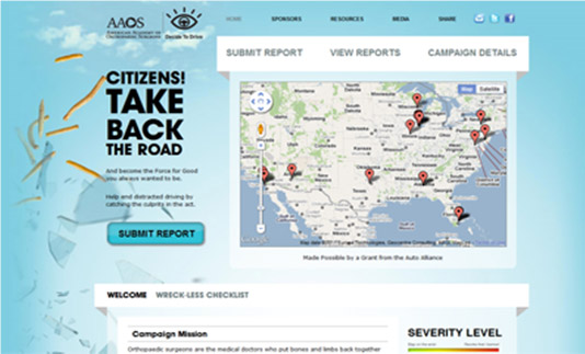
Full Website

Mobile Website
As you can see from the two screenshots above, the mobile site opens up with a warning message meant to ensure visitors are not distracted drivers. Being on a mobile phone also means limiting graphics and website functionality in favor of speed and load times. The full site features a large map listing each observation submitted thus far, which will take a few minutes to load over 3G and your phone provider’s network. Leaving out the large background image is another feature that will improve the mobile site’s performance.
 Once the warning message on the mobile website is accepted, the visitor is greeted with a friendlier page and navigation buttons (seen to the left). A good mobile site will sustain the important details from the full site, while condensing the layout for a smaller screen. By providing buttons large enough to be clicked by a finger, the visitor can easily navigate the mobile site and view reports, just as they would on the full site.
The layout of a mobile site should keep the same look and feel as the full website with similar colors and button styles. Keeping the main logo at the top of the site with a call to action will catch the visitor’s attention and give them a direct first step.
While browsing the mobile site, you’ll notice only the home page has the large navigation. Because the buttons take up so much real estate on a mobile browser, it’s common practice to add a “Back to Home” button on sub-pages. This skips the user right to the content, such as on the view reports page (seen to the right). Another best practice is to have your content in expand/collapse sections. Having some brief sentences with a “read more” button, which allows visitors to view your site’s full content, will keep visitors from being overwhelmed by a large amount of text.
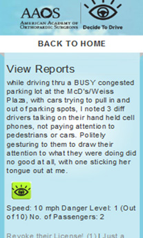 Regarding the view reports page, there are some key differences between the mobile and full sites. On the full website, visitors are able to search reports by location and browse the “worst offenders,” which can be voted on. The voting functionality remains on the mobile site, but the search features have been removed. The mobile website is for quick information at a glance, so listing only the most recent reports is the best way to go. Visitors won’t be spending hours on a mobile site carefully studying an article and looking for news archives to learn more.
The main points to take from this blog post are as follows:
- Mobile websites and full version sites have some similarities between content and color schemes but differ greatly in presentation and purpose;
- Mobile websites can be thought of as summaries of a full website, complete with content, graphics, and features, but still able to provide valued information; and
- A mobile website needs to go through the full process with a new design, new purpose and new target audience to focus on.
For a closer look, be sure to visit Decide To Drive on a full-sized screen and a cell phone.


