Common ADA Compliance Errors Explained

The law requires your website to be ADA compliant. All sites are susceptible to some common ADA errors, and many site owners are unaware just how many errors they can be making. When WebAIM scanned 1 Million pages in early 2020, over 60 million distinct accessibility errors were detected. That’s an average of 60.9 errors per page.

What does this mean for your website or that website you are going to build? Some of the most common errors come from the design of the site, such as color contrast. However, there are still many that can occur from a development perspective. Some of the more complicated errors include device-dependent events or targeting keyboard focus on certain elements. This post outlines the six most common ADA violations and who can fix them.
Design: Low Contrast
The most common ADA error according to WebAIM is low color contrast for text. Sometimes this can be an easy CSS fix, but in some cases, this can negatively affect the original design of the site. For this reason, color contrast must be taken into consideration when initially designing a site.
In many cases, it is fairly simple to achieve a color contrast of 4.5:1 through having a solid color background; modern websites, however, may use images as the background for text, so the contrast is not as easy to gauge. Designers must also keep this in mind when creating banner text for instance.

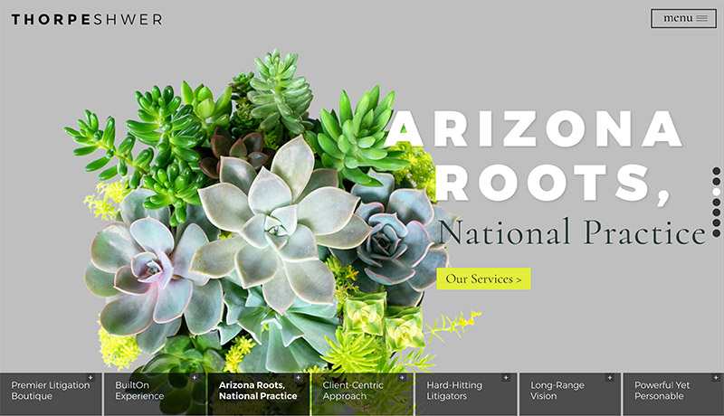
This award-winning intellectual property law firm website uses a white background to ensure that the headline is visible over the homepage video.
Structuring all the content of the sites plays a big role in the accessibility of the site in terms of screen reading technology and keyboard focus navigation. It is imperative to present information and content in a natural and organized manner. Generally, if text must be visually read diagonally or in any other order than left-to-right, it will probably be difficult to read for screen readers.
Design + Development: Missing Alternative Text
A picture is worth a thousand words. Unfortunately, a thousand words may be too much for alternative text. Alternative text is another important necessity for screen reading technology and also another common issue regarding ADA compliance.
Often overlooked, alternative text or “alt text” provides a description or context to an image and is needed for all images. This is essential if there is no surrounding text to give context to the image. Conversely, if the image already has an adjacent title or caption, the image can have an empty alternative text attribute like so:

Adding an empty alternative text attribute tells the screen reading technology that it can be ignored since there is already descriptive text around the image. Aside from screen readers, alt text is also a good indicator of what the image should be if for any reason the image becomes unavailable.
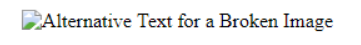
You may be wondering at this point, why is alternative text so important? ADA compliance heavily relies on alternative text to convey the same content and information as the image, otherwise, the image is not fully accessible. It is for this reason that there are many strict rules revolving around the alternative text.
Among other rules, alt text for an image must be unique and concise. If there is another image nearby, the adjacent image should not have the same alternative text. This also applies to adjacent text, to avoid redundancy for screen readers, if the alternative text of an image already appears in nearby text, the image may be given empty alternative text.
Alternative text must also adequately describe an image. Alt text may be deemed “suspicious” if it contains insufficient or extraneous content. Screen reading technology informs the user that the element they are viewing is an image, so using verbiage such as “image” or “picture” is unnecessary and should be avoided altogether.
Content: Empty Links
The same principle applies to all links on a page. Link text must accurately describe the link. The WebAIM survey mentioned above found that 24% of pages had ambiguous link text, such as “click here”, “more”, “continue”, etc.
- Pages flagged for empty links averaged 5.4 instances of ambiguous links for a total of nearly 1.3 million ambiguous links.
When writing and displaying your website content make sure that you are following best practices for internal and external links. One way to do this is to provide an outline when hovering and focusing these links through CSS. The outline on elements and links provides a visual cue to show the interaction between the user and an element. Many times websites will remove the outline for design purposes, but this posts a major accessibility issue.
Without an outline, keyboard users using the tab function to navigate through the site will not know which elements are being accessed. When reviewing a website for ADA errors, it is important to imagine navigating through the site without a mouse. This can help keyboard users and screen readers immensely.
Adding hover states to an element on a page indicates that you can interact with the element in some way. An easy way to make your website more lively is by adding different CSS styles when hovering certain elements. Without a focus state set animations and hover states cannot be viewed by keyboard users. This poses an accessibility issue. A quick and easy way to fix this is to make sure that all hover states in your style sheets are accompanied by focus states.
This same principle applies for any and all Javascript that is loaded in the page. An event handler such as “onmouseover” or “onclick” signifies a device-dependent event; the same rule applies, these events must be accompanied by “onfocus” events. Otherwise, the event can also be triggered by checking for an “onkeydown” event, thus making the Javascript device-independent.
Content: Transcripts for Videos and Audio
It is very common to use YouTube video embeds across various core pages of your website as supplemental content. While videos and explainer videos provide a great source of visually dynamic content to the page, typically YouTube’s auto-generated captions are not of sufficient quality to be considered equivalent to the video’s audio.
Since YouTube uses voice recognition for the video’s synchronized captioning, it is generally not as accurate as the actual audio. However, you can still verify that the auto-generated captions are accurate by ensuring that the synchronized captions match the audio accordingly.
For all non-live video content, it is important to provide closed captioning or adjacent transcripts for users who are deaf or hard of hearing. The only exception to this guideline is if the video is purely decorative, which does not require transcripts.
Audio content such as podcasts and MP3 files fall under the same criteria. In order for the audio content to be accessible, transcripts of relevant content should be provided.
Development: Empty Buttons
Similar to links and images, buttons must also have descriptive text. Many times websites will use buttons for navigational purposes or as an alternative to displaying a link through hyperlinks. Regardless of the function, all buttons must have descriptive text presented to screen readers.
Although buttons need some form of contextual text, this text does not need to be visible. As long as the text is still accessible to screen reading technology, the text within a button can be hidden using CSS.
Development: Missing Form Labels
Form labels have a similar function to alternate text in which they provide a visible description of the purpose of the form. Many sites, including most law firm sites, have contact forms where clients can get in touch with the firm.
These forms, like images, must be labeled accordingly to provide context to screen readers. Each individual element in the form does not require a label, elements that need a label include:
- <input>
- <select>
- <textarea>
Other elements that do not require labels that may reside in a contact form include form controls such as the submit or reset buttons.
Development: Multiple Form Labels
All form fields (name, phone, email, etc.) require labels with specific IDs attached to the corresponding input fields. Each ID needs to be unique to only one label/input combination on the page.
When the Gravity Forms plugin, for instance, creates a form on the page, it gives each input its own label. If the same form is used twice on the page, the same labels/inputs are duplicated on the page which creates the ‘Multiple form labels’ issue.
With this second form, all inputs no longer have unique IDs. This is invalid HTML and poses a potential accessibility issue to screen reader users when they click on a label. Aside from the accessibility aspect, if one of the forms with the same ID is submitted, the browser might get confused and submit the other form with empty values.

The solution is to ensure that each input for each form on the page has a unique ID and only has one associated label.
Development: Missing Document Language
If you don’t set a language for your site, it will not be accessible to screen readers. Adding the document language only requires an attribute in the <html> tag to open the page. For example:
- “En” identifies English as the primary language of the page
Different languages have different codes, see W3C Language Code Reference for more details.
Development: Inaccessible Dropdowns
Level A compliance outlines the bare essentials for website accessibility. Fortunately, many standard HTML elements are already compliant and accessible to most users. Complex elements such as dropdowns or content accordions are where we have to pay closer attention to accessibility issues.
Success criterion 2.1.1 states:
“All functionality of the content is operable through a keyboard interface without requiring specific timings for individual keystrokes, except where the underlying function requires input that depends on the path of the user’s movement and not just the endpoints.”
In other words, if a HTML element is interactable by mouse, the element must also be able to function using keyboard inputs such as arrow keys or the space bar. This is where things can get complicated. If an older plugin is used for accordion functionality, the code may not be equipped to support keyboard event handlers. In this unfortunate case, it may be possible to reach out to the developers of the plugin to update their functionality.
Is Your Law Firm Website Accessible?
Is your site ADA compliant? Accessibility errors overall increased from 2019 which is again surprising considering the spotlight that has been on the issue. By staying ahead of the accessibility game, our websites will continue to stand out. All websites should make accommodations for people with disabilities. Get your website scanned for errors today!
What you should do next . . .

Nature has form, function and color in abundance. It is a hands down winner for supplying inspiration.
Join our newsletter, where you will learn educational info on latest insights, tips and best practices.
Share:
About Us
Did you know more than 200 clients have worked with PaperStreet for more than 10 years?
Get a Free Website
Analysis and Consultation
Marketing Services