Skip to Content

- Colors.
Choosing the right color can make a logo stand out in the crowd. However, it is also important to make sure that the logo translates well in black and white too. Keeping colors to a minimum is also helpful to keep printing costs low and it ensures that your logo isn’t too busy when scaled down on smaller screens or print materials. - Typography.
Logos convey a lot with very little text, and the font you select can send a message. A serif font can communicate that your firm is professional and traditional, whereas a bold font could speak to your firm’s strength and power. - Elements.
Part of keeping your logo timeless is limiting the amount of elements, textures and filters used. For example, absolute “no, no’s” are drop shadows and photographs within the logo. - Simplification.
The latest trends show that companies are rebranding their logos to a simpler version of what they have. Sleeker and more focused identities will become the norm soon. - Gradients.
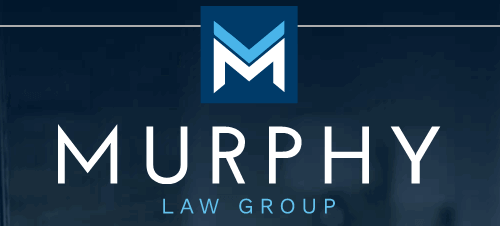
Blending colors to form a smooth gradient has been trending since last year and it doesn’t seem to be going anywhere for 2021. It’s a nice way to use only 2 colors but add what seems like additional colors and impact. - Animation.
A great way to enhance and draw more attention to your identity online is to add animation. Whether it be a script that looks like the letters are being drawn out or emphasizing a particular element within the logo, adding motion elevates your logo to the next level. - Casual Fonts.
The chosen typeface of a logo can set the tone and trends are showing a less conservative and more casual feel to the overall look. - Icons.
An icon can be an elegant compliment to your firm or business name, and something you can use to visually represent your brand- but choose wisely. Avoid cliche images that blend your firm in with the crowd. Instead, symbolic or abstract imagery can be impactful. In fact, your icon doesn’t have to relate to your brand at all- think about the most well-known logo icons of 2023 (Nike, Apple, Pepsi, Starbucks, etc.). What’s more important is that the style communicates a feeling that you want associated with your brand. - Asymmetry.
Don’t be afraid to stagger and off set your logos for extra visual interest. - Wordmarks.
As simplification becomes more desired, consider working with the company name as the main focus and adding small elements for the overall logo. - Legibility.
It’s important that your logo is easy to read, even at smaller sizes or against various background colors.


![]()
![]()
![]()