
Design your Web Site for What Monitor Size?

By Peter Boyd on February 12, 2010 in Web Design
Services: Law Firm Website Design . SEO . Internet Marketing . Law Firm Marketing Guide . Content Marketing . PPC
There are countless monitor variations to design for. Some monitors are large, some small, some wide, some tall. Some browsers have multiple tabs / menus, some browsers open not full width. What is a web designer to do?
Recommendations
- Design your site for your audience. Take a look at your web site statistics and see exactly what your monitor resolutions are. If you don’t have statistics, then use some default assumptions – see below.
- Design for the largest percentage. In the stats below, you will see that 800 x 600 is only 1%. Will those people viewing your site have a bad experience?” Probably. But I want to cater our site to the 97% of other people who have modern monitors.
- Design for at least 1024 x 768. When in doubt, set up your web site so that it positions nicely in a 1024 monitor. You can increase this setup in the coming years as a large percentage of people will have 1280 or higher resolution settings.
- Design to fit. For a 1024 x 768 monitor, setup the site so that it its no wider than 960 pixels.” Every browser window has scroll bars and other little edge elements. If you design to exactly 1024, then your design will not fit and the right side parts will be missing, causing the user to scroll left/right to see everything. To avoid this setup the design so that it fits within a 960 pixel wide framework
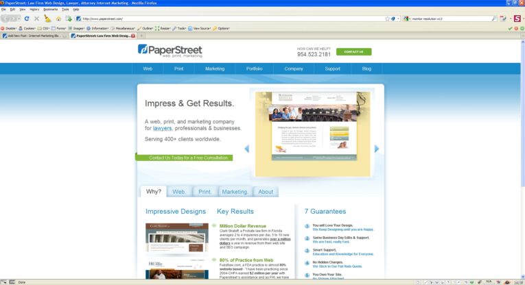
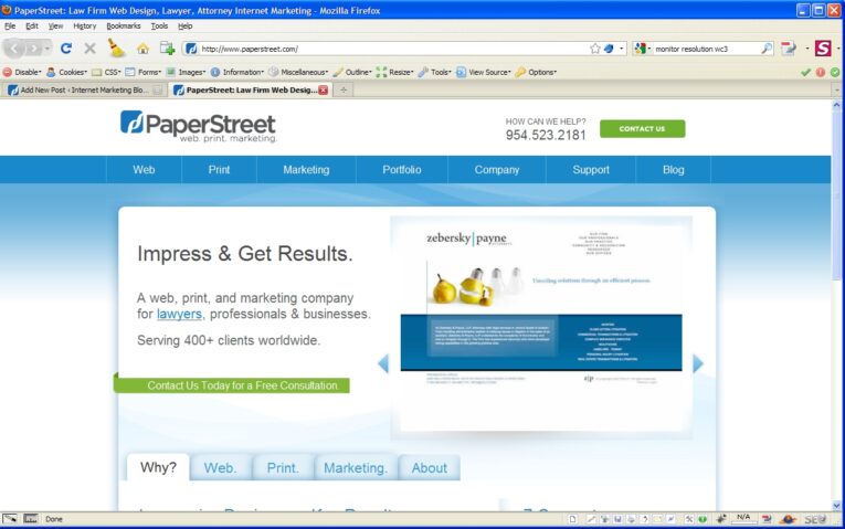
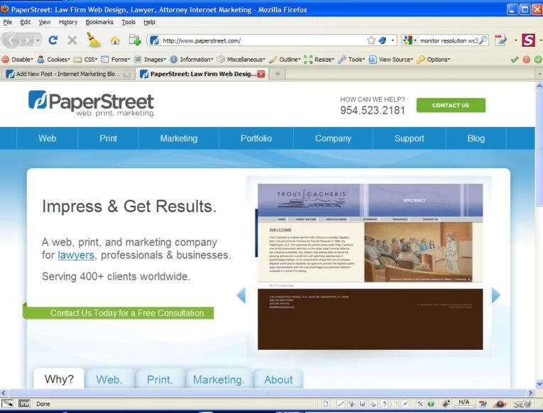
- Design for above the fold. For a 1024 monitor, setup the site so that your key info is not below 575 pixels in height. Same idea as the width. Most users will various menus and tabs that take up the first 200+ pixels on the screen. Put your key ideas, benefits above the fold. In our screen shots below, with minimal extra navigation bars the elements must fit above 575 pixels. For every additional navigation bar in Firefox or IE, you need to reduce your information to get above the fold.
Browser Statistics from W3 Schools – January 2010
- 76% – Higher than 1024 x 768
- 20% – 1024 x 768 pixels
- 1% – 800 x 600 pixels
- 3% – Unknown
Cool Examples – Click Each to See the Browser Screen
The thumbnails are not accurate as WordPress is zooming to the center of the image.
-

- 1920 x 1080
-
- 1440 x900

-
- 1280 x 800
-
- 1024 x 768
-
- 800 x 600

